The Retail Trader Framework
From chaos to clarity: a simple, rule-based approach that replaces guesswork with probabilities, structure, risk management and psychology
We created this framework because we’ve felt the struggles it solves firsthand. We’ve chased headlines, argued with “value,” moved stops, added to losing trades, overtraded in noisy markets, and watched solid ideas collapse under poor risk management. Like many retail traders, we were overwhelmed with information but lacked a clear, repeatable process. We kept trying to predict the next big move while institutions were already trading the move in progress. This guide takes the lessons from those mistakes and boils them down into something simple and practical: a way to stop guessing, follow what’s actually happening, and let probabilities—not emotions—do the work. It’s designed for traders who want fewer decisions, clearer rules, smaller losses, and a calmer, more consistent path to growth. In short: it’s the playbook we wish we had when we first started trading.
This guide assumes you already have a basic understanding of trading and market mechanics — things like candlestick charts, order types, timeframes, support/resistance levels, position sizing, and different types of securities.
Stop Trying to Predict the Future
Fundamental analysis often creates “beautiful illusions” — stories that sound convincing in hindsight but remain ambiguous when predicting future market moves. The truth is, retail traders face massive information asymmetry against institutions, and even if you had all the data, you could never be certain how much of it is already “priced in” or what the market is actually expecting. History is full of moments when markets behaved in ways that looked irrational to outsiders:
- COVID-19 Recovery (2020) — After the March 2020 crash, SPY surged over 50% to new all-time highs by August, even while unemployment was elevated and businesses were shuttered. The disconnect between economic reality and market performance was striking.
- Fed Rate Hike Cycle (2017–2018) — Despite rising borrowing costs and tighter liquidity, SPY gained ~25% in 2017. The decline only arrived late in 2018, long after the tightening began.
- Brexit Vote (2016) — The UK’s decision to leave the EU triggered a 5.3% drop in SPY over two days. Yet within three weeks, the index had fully recovered, and by year-end 2016 it was up over 9%. Markets shrugged off long-term risks and treated the event as a buying opportunity.
These examples show that markets often move more on speculation and money flows than on neat, logical “fundamentals.” Sure, prices may eventually come back in line with a company’s “true value,” but the timing is anyone’s guess. You could be stuck holding a stock for months — or even years — waiting for that to happen. That’s the trap many retail traders fall into when they rely too much on fundamentals alone. When you lean heavily on fundamentals, you’re really betting against the market itself. Every price you see already reflects the actions, beliefs, and capital of millions of traders — including big institutions with more data, faster tools, and deeper pockets than any retail investor. If you think a stock is “undervalued” or “mispriced,” you’re basically saying you know better than the entire market. It’s not impossible, but the odds are stacked against you. And there’s another layer: research shows that up to 80% of daily U.S. stock trading is done by algorithms. These systems don’t care about earnings reports or news stories — they trade on probabilities, liquidity, and price action. That means price often tells the story of what institutions are thinking before the fundamentals ever make the headlines.
Understand Your Strengths
If you try to go head-to-head with big institutions on their own turf, you’ll lose. They’ve got bigger budgets, faster technology, and way more resources. But here’s the good news: you don’t need to beat them. Most of the time, institutions are too busy competing with each other. Their main goal is to create enough movement (volatility) to buy or sell their huge positions at good prices — not to chase down your tiny stop-loss. As a retail trader, you actually have some unique advantages that pros can’t match:
- Follow, Don’t Predict — Stop trying to call exact tops and bottoms. Instead, watch where the big players are pushing the market and ride those waves, like drafting behind the fastest car on the track.
- Patience Is Power — Institutions are forced to stay active because they have quotas, clients, and mandates. You don’t. If the setup isn’t right, you can sit out. That ability to wait is a hidden edge.
- Impact-Free Trading — Large funds can’t enter or exit positions without moving the market. Their size forces them to break trades into chunks, which exposes their intent. As a retail trader, your smaller orders fly under the radar — you can get in and out at exact levels without shifting the price.
- Simplicity Without Red Tape — Institutions have to juggle risk models, hedges, and client expectations. You don’t. You can keep things simple, stick to your rules, and act the moment opportunity appears. In the next section, we’ll show you a practical framework for turning these advantages into real trades — so instead of fighting the big players, you learn how to move with them.
Set The Foundation
Let’s start with a few key choices that can immediately tilt the odds in your favor. These aren’t guesses — they’re backed by decades of data. Think of them as ways to quietly load the dice so the probabilities work for you, not against you.
Trade the Strongest Market
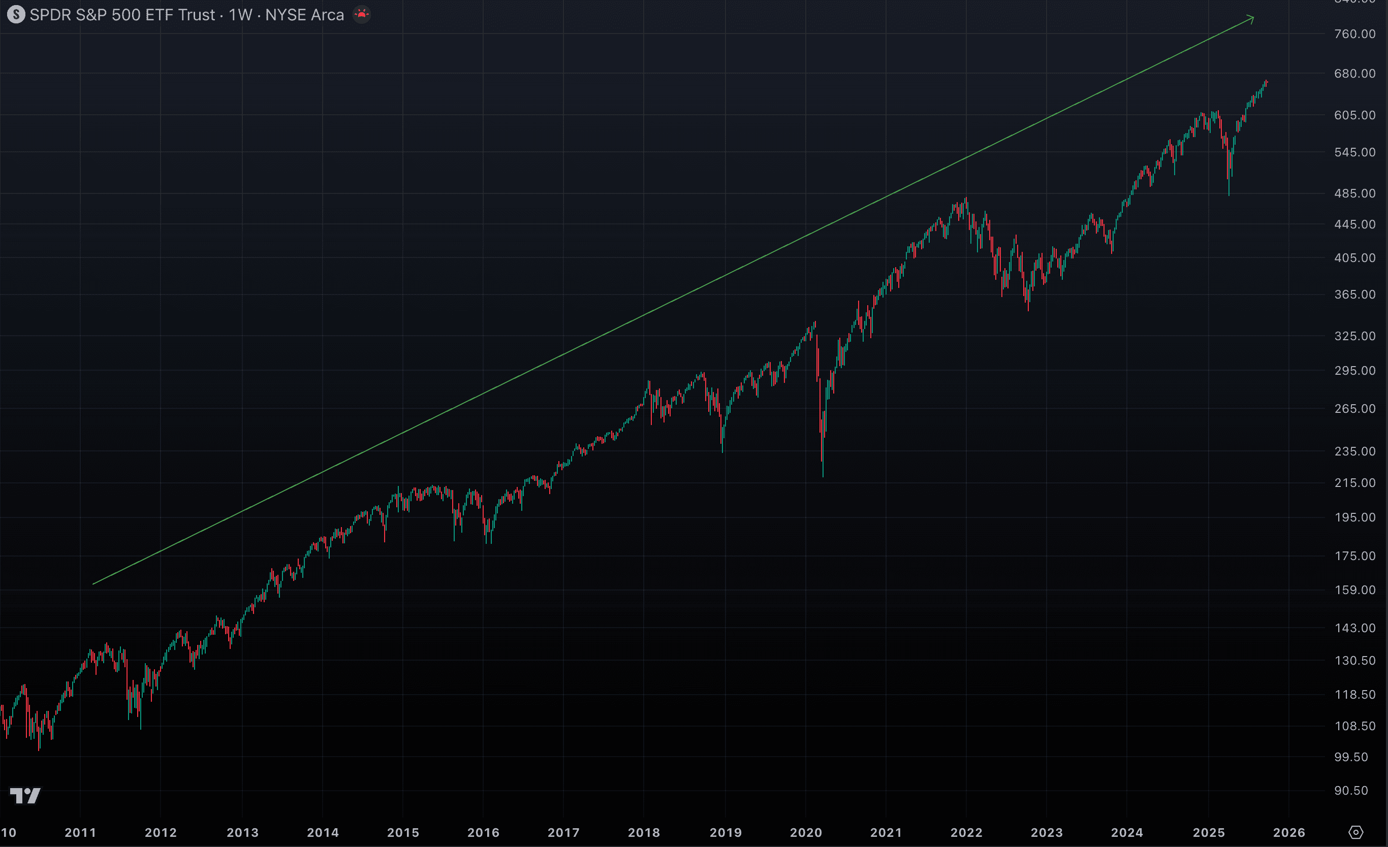
For more than 20 years, the U.S. stock market has outpaced nearly every other major economy. In the last decade alone, the S&P 500 averaged 13.8% annual returns, compared with just 4.9% for global stocks. Since the financial crisis, this strength has only deepened — the U.S. market has shrugged off countless “end of the bull” predictions and continued rewarding those who stay with it. The lesson? Go where the strength is. Focus on the world’s leading market — the U.S. — and don’t get shaken by daily doom-and-gloom headlines. The media thrives on fear. Your job is simpler: tune out the noise and focus on building your capital where the odds are best. At the same time, we’ll show you how to stay prepared for any outcome — and how to step aside quickly when the first signs of real weakness appear.
Take a look at the SPY (S&P 500) chart over the past 15 years. What do you see — a bull trend or a bear trend?
Stay Bullish
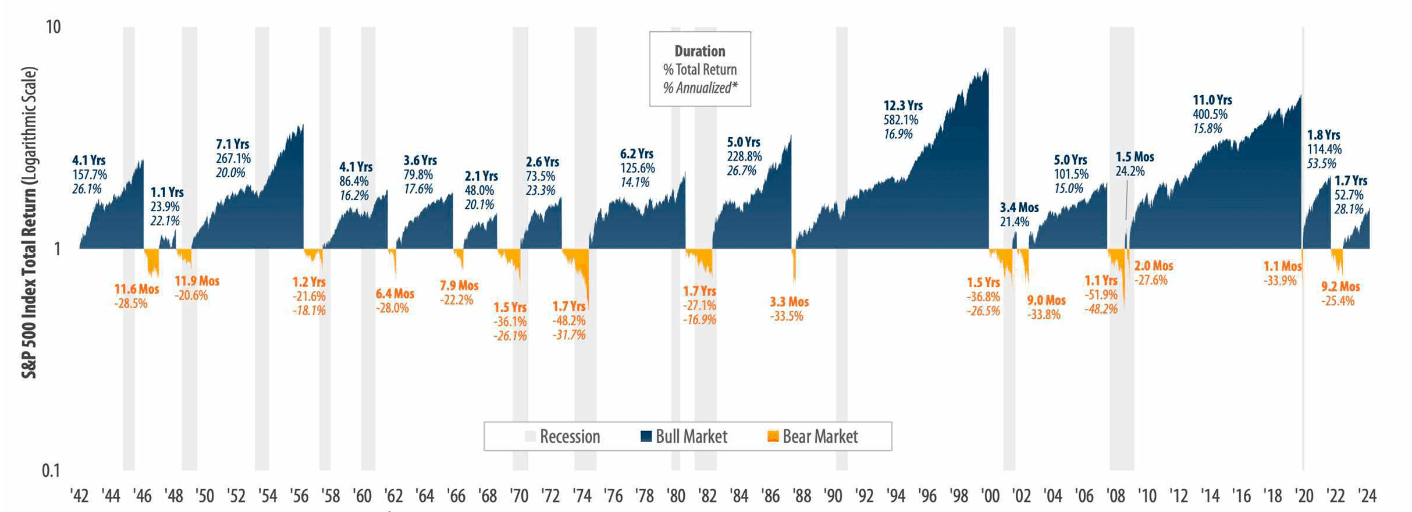
History shows a striking imbalance between bull and bear markets in the U.S. Over the long run, bull markets have lasted an average of 4.1 years, delivering a powerful 149.2% cumulative gain. In contrast, bear markets have averaged just 11.1 months, with a typical drawdown of -31.7%.
The takeaway? The market spends far more time climbing than it does falling. Until clear evidence proves otherwise, it makes sense to stay aligned with the dominant trend and position yourself to capture that upside momentum.
Respect the Trend
Decades of research prove it: trend-following strategies beat trend-reversal strategies across most market conditions. Metrics like CAGR, Sharpe ratio, and drawdown control all favor following the trend. Why? Because the odds are higher that a trend keeps going than that it suddenly flips. That’s why it’s often more profitable to buy strength than to bottom-fish weakness. Strong markets usually stay strong, and struggling ones can stay weak much longer than you expect. Trading with the trend gives you higher-probability setups and smoother results compared to constantly trying to “call the turn.”
Timeframe Matters
The data is brutal: 70–90% of traders lose money, and day trading is the worst of it — only 1% remain profitable over five years, while 72% finish each year in the red (FINRA). Much of the market’s real growth actually happens outside the intraday noise, in overnight and weekly moves. That’s why this framework focuses on daily and weekly timeframes — long enough to filter out random price chops but short enough to act on meaningful momentum.
Understand the Market Hierarchy
The SPY ETF serves as a proxy for the broader U.S. stock market because it tracks the S&P 500, which represents about 80% of the total U.S. market capitalization across 500 companies and all major sectors: technology, healthcare, financials, consumer goods, energy, and more. When people ask, “How’s the market today?” they’re usually referring to the S&P 500. Professional investors, media, and fund managers use the S&P 500 as the benchmark for U.S. equity performance. Most individual stocks are positively correlated with the index — while a few may buck the trend, the majority move in line with it. Understanding this hierarchy helps you see where the real market momentum lies.
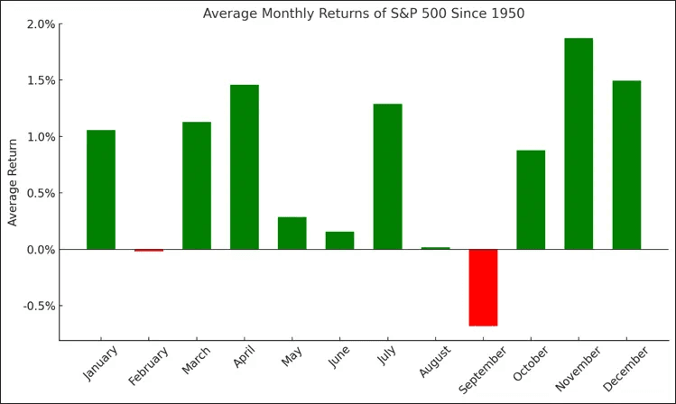
Use Seasonality Data
Historical data since 1950 reveals clear month-by-month patterns in S&P 500 returns:
- Strongest months: November (1.8% avg), December (1.6%), April (1.4%), March (1.3%)
- Weakest months: September (-0.5%), August (-0.1%), June (0.1%), February (0.2%)
Use seasonality as complementary data to identify periods with favorable probabilities.
S&P 500 Monthly returns, %, since 1950
Prefer ETFs Over Individual Stocks
An ETF (Exchange-Traded Fund) is like a ready-made basket of investments. Instead of buying just one stock, you’re instantly diversified across dozens or even hundreds of them. ETFs trade on exchanges just like individual stocks, but because they spread risk across many companies, they help protect you from the damage a single bad stock can cause.
Here are some of the most liquid and widely used ETFs:
- SPY (SPDR S&P 500 ETF) — The most traded ETF in the world, tracking the S&P 500. Daily trading volume often exceeds $20B. It is market-cap weighted. That means the biggest companies (Apple, Microsoft, NVIDIA, Amazon, etc.) carry the most influence. For example, the top 10 stocks alone make up around 30% of SPY’s weight. When tech runs hot, SPY tends to surge because those giants dominate the index.
- QQQ (Invesco QQQ Trust) — Tracks the Nasdaq-100, giving you exposure to the biggest names in tech including Nvidia, Microsoft, Apple, Meta etc.
- SMH (VanEck Semiconductor ETF) — A focused play on semiconductors, one of the fastest-growing and most influential sectors in the market especially in the modern AI era.
- DIA (SPDR Dow Jones Industrial Average ETF) — Tracks the Dow Jones, made up of 30 iconic U.S. blue-chip companies.
- RSP (Invesco S&P 500 Equal Weight ETF) — This gives every company in the S&P 500 the same weight. A small-cap industrial stock counts just as much as Apple or Microsoft. That makes RSP more balanced across sectors, less dependent on mega-cap tech, and often a better reflection of how the average stock in the S&P 500 is performing.
Research overwhelmingly shows that trading indexes and ETFs delivers better risk-adjusted returns than trying to pick individual winners. They remove single-stock risk and let you ride broader market or sector trends without worrying whether one company misses earnings or collapses on bad news. That said, if you do want to use the Framework to trade individual names, stick to established leaders — AAPL, MSFT, NVDA, META, AMZN, etc. — and make sure they're in strong, clear uptrends.
PRIIPs and ETF Access for UK/EU Investors
Due to PRIIPs (Packaged Retail and Insurance-based Investment Products) regulation, most US-domiciled ETFs (like SPY, QQQ, SMH, DIA, RSP) are not directly available to UK/EU retail investors. This rule requires funds to publish a Key Information Document (KID), which US providers generally do not. As a result, unless you qualify as a “professional client” or use a broker with special access, you’ll need to trade UCITS-compliant alternatives listed on European exchanges (LSE, XETRA, Euronext, etc.). Always confirm availability with your broker.
UCITS Alternatives
- S&P 500 (SPY alternative)
- iShares Core S&P 500 UCITS ETF (CSP1 / SXR8)
- Vanguard S&P 500 UCITS ETF (VUSA)
- Xtrackers S&P 500 UCITS ETF (XSPX)
- Nasdaq 100 (QQQ alternative)
- iShares Nasdaq 100 UCITS ETF (CNDX)
- Invesco EQQQ Nasdaq-100 UCITS ETF (EQQQ)
- Semiconductors (SMH alternative)
- VanEck Semiconductor UCITS ETF (SMH) – EU-listed UCITS version
- Lyxor MSCI Semiconductors UCITS ETF (SEMI)
- Dow Jones Industrial Average (DIA alternative)
- iShares Dow Jones Industrial Average UCITS ETF (DOIJ)
- SPDR Dow Jones Industrial Average UCITS ETF (DJIA)
- S&P 500 Equal Weight (RSP alternative)
- Invesco S&P 500 Equal Weight UCITS ETF (SPEQ)
Many US-domiciled ETFs (e.g., UPRO, TQQQ, SOXL) are not available to UK/EU retail investors due to PRIIPs regulation (lack of Key Information Documents). Availability depends on your broker and local rules. Always check what’s accessible in your jurisdiction before planning trades
The Technical Framework
This section is about the actual technical analysis we use to read and trade the market. With countless indicators, theories, and charting tricks out there, most only add noise. Our goal is to strip it down to the few tools that truly matter — the ones institutions, algorithms, and traders everywhere are watching. Because these tools are universal, they’re easily identifiable, programmable, and seamlessly built into institutional systems. In practice, that means price itself will “recognize” these levels and consistently “interact” with them, giving us a framework that is simple, consistent, and highly effective.
Moving Averages (MA)
Moving averages are one of the simplest and most powerful tools in trading. Instead of looking at every up-and-down tick, they smooth out price data by showing the average closing price over a certain number of days (or periods). This creates a clean line on the chart that helps you quickly see the overall direction of the market and spot areas where price may find support or resistance.
Because moving averages are based on past data, they naturally lag behind price a little. But that’s part of their strength — they cut out the noise and highlight the big picture.
The basic idea:
MA = (P1 + P2 + ... + Pn) / n
Where:
- MA = Moving Average
- P = Closing prices for each period
- n = Number of periods (like 20 days, 50 days, etc.)
Two main types:
- Simple Moving Average (SMA): Treats all days equally.
- Exponential Moving Average (EMA): Gives more weight to recent days, so it reacts faster to new price moves.
Classic use case:
Traders often watch two EMAs together:
- A slow EMA (like the 26-period) to show the long-term trend.
- A fast EMA (like the 12-period) to catch shorter swings.
When the fast EMA crosses above the slow EMA, it’s often seen as a buy signal. When it crosses below, it can act as a warning to exit.
SPY: 26 EMA (orange) and 12 EMA (white) on the weekly (W) chart
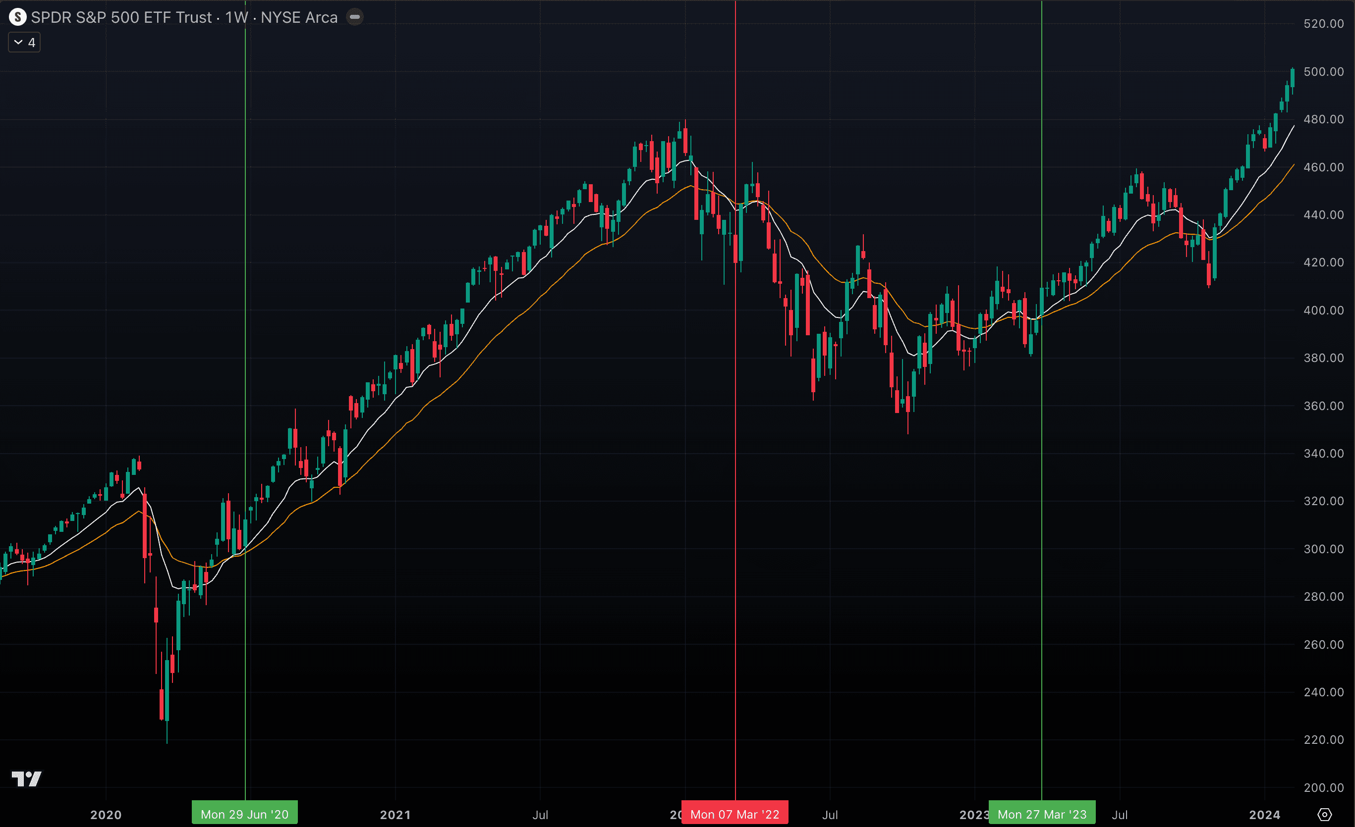
While moving averages can look extremely effective when you scroll back through charts, that view can be misleading. What you see in hindsight is often a “clean” crossover that lines up perfectly with market moves — but that’s because moving averages constantly recalculate with each new price. In real time, the crossovers you see today might shift or even disappear tomorrow, making them less reliable than they appear in the rearview mirror. The bigger issue is that moving averages are lagging indicators. They react to price — they don’t predict it. By the time a crossover flashes a signal, a large part of the move may already be gone. This limitation gets even worse in sideways or “choppy” markets, where the averages whip back and forth, creating lots of false or premature signals that drain both confidence and capital.
SPY and its 26 (yellow) & 12 (white) EMA W in sideways market
 But what if instead of chasing moving average crossovers, we shift the focus to how price reacts to specific moving averages? Take the 200-period EMA on the weekly chart as an example. It’s one of the most widely watched levels in all of trading — often treated as a dividing line between long-term bull and bear markets. When price approaches this average, institutions and retail traders alike pay attention, making it a critical benchmark for overall market direction.
SPY and its 200 EMA W (Weekly)
 Look at the 200 EMA (red line) — notice how price often bounces off it, consolidates around it, stretches away from it, and eventually comes back. This whole cycle can take two to three years to unfold, but for long-term investors it’s one of the most important levels to watch. It acts like a kind of “fair value,” where the majority of market participants are comfortable stepping in to buy. And here’s the key: you don’t need news headlines or fundamental analysis to validate it — the price action itself tells the story.
We’ll cover a structured strategy for trading these moves later, but here’s the question: what if you don’t want to wait years for the next setup? In that case, you can drop down a timeframe and use the 200 EMA on the daily chart to look for earlier entry opportunities.
Look at the 200 EMA (red line) — notice how price often bounces off it, consolidates around it, stretches away from it, and eventually comes back. This whole cycle can take two to three years to unfold, but for long-term investors it’s one of the most important levels to watch. It acts like a kind of “fair value,” where the majority of market participants are comfortable stepping in to buy. And here’s the key: you don’t need news headlines or fundamental analysis to validate it — the price action itself tells the story.
We’ll cover a structured strategy for trading these moves later, but here’s the question: what if you don’t want to wait years for the next setup? In that case, you can drop down a timeframe and use the 200 EMA on the daily chart to look for earlier entry opportunities.
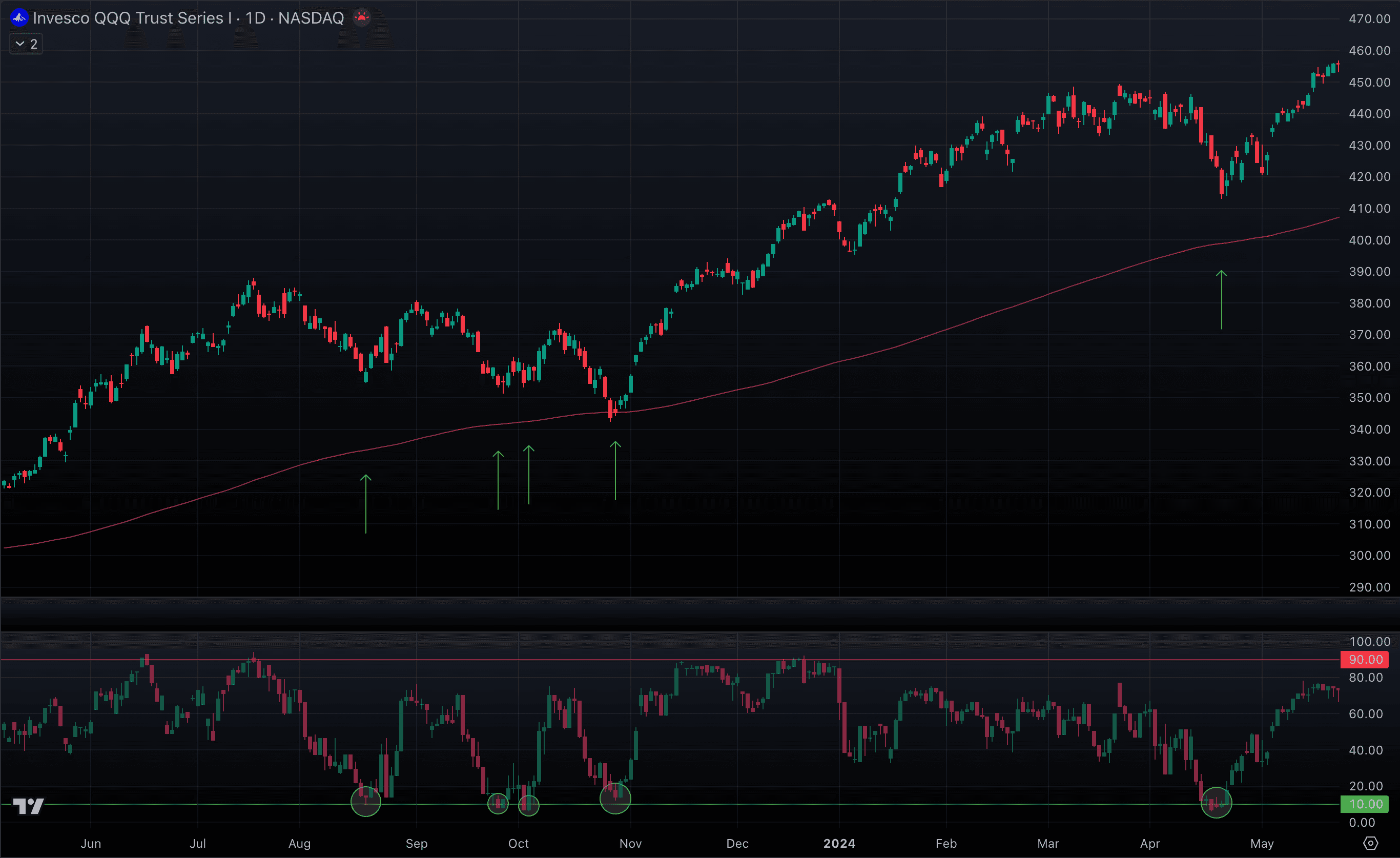
QQQ and 200 EMA D (Daily)
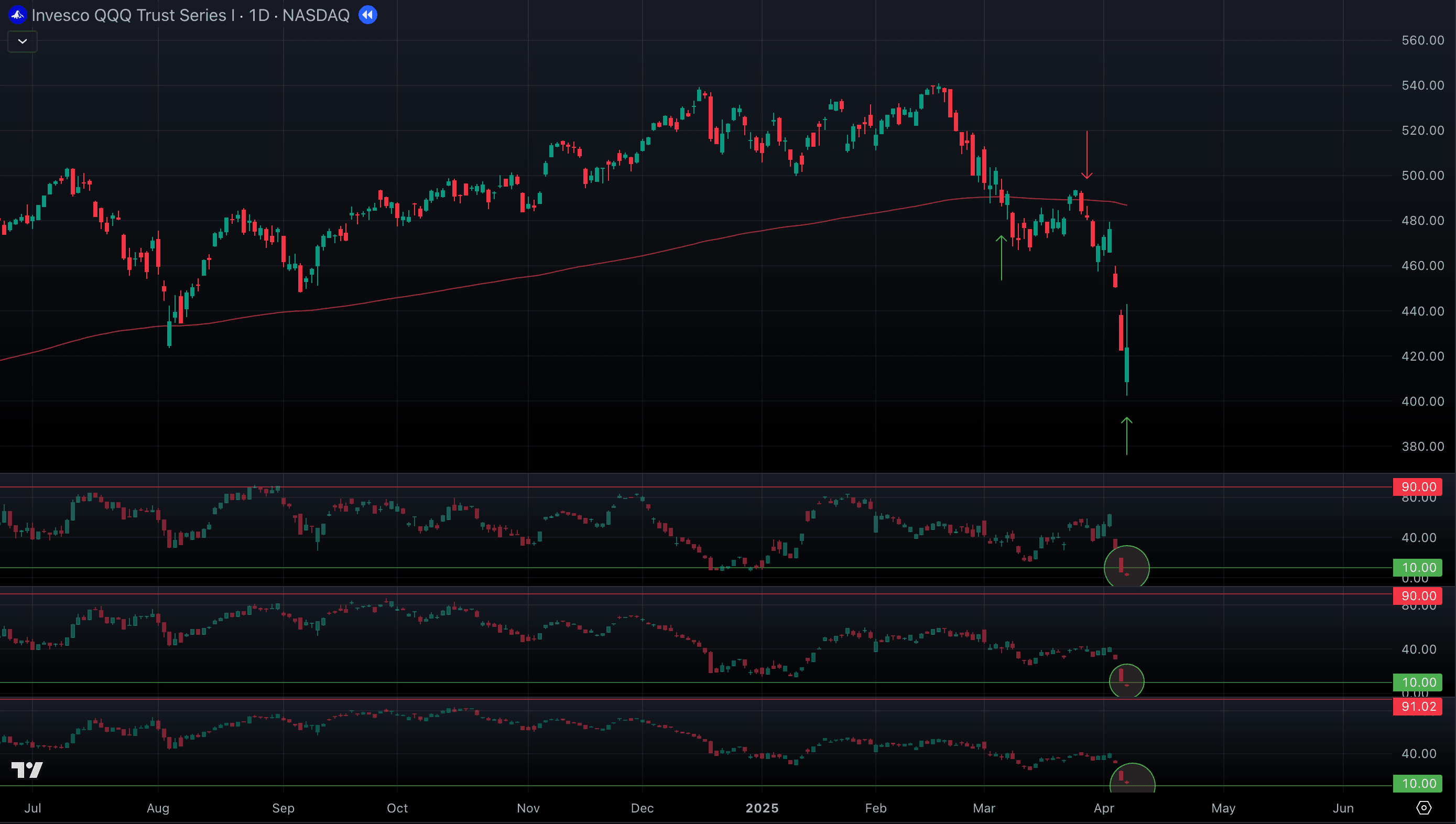
 Notice how price often reacts to the 200 EMA on the daily chart — bouncing from it, consolidating near it, and creating short-term “micro-trends.” When price stays above the line, the trend is typically bullish; when it drops below, the bias turns bearish. Can this be traded? Absolutely.
So why does the 200 EMA matter so much? It’s widely followed — by individual traders, institutions, and even automated algorithms. When enough market participants pay attention to the same level, it becomes a kind of self-fulfilling benchmark. But of course, it doesn’t always work perfectly. You’ve probably seen charts where the 200 EMA looks meaningless and price action seems chaotic. That can happen for a few reasons:
Notice how price often reacts to the 200 EMA on the daily chart — bouncing from it, consolidating near it, and creating short-term “micro-trends.” When price stays above the line, the trend is typically bullish; when it drops below, the bias turns bearish. Can this be traded? Absolutely.
So why does the 200 EMA matter so much? It’s widely followed — by individual traders, institutions, and even automated algorithms. When enough market participants pay attention to the same level, it becomes a kind of self-fulfilling benchmark. But of course, it doesn’t always work perfectly. You’ve probably seen charts where the 200 EMA looks meaningless and price action seems chaotic. That can happen for a few reasons:
- The type of participants we’re tracking (institutions, algos) simply aren’t active in that market or stock.
- The level has been tested too many times in a short span, which weakens its influence.
- A rare “black swan” event is underway, when extreme fear or shock overrides technical structure.
The takeaway is simple: don’t assume a moving average will always work. If you don’t see clear historical evidence of price respecting that level, skip the trade.
CL and its 200 EMA D - this is not what we are looking for
Alright, but is the 200 EMA the only level that matters? Of course not. Traders and institutions also watch several other moving averages very closely, and these can create equally powerful opportunities:
- 20 EMA & SMA (daily chart): These averages often define a strong trend. During momentum phases, price tends to stretch away from them, then pull back for a retest. The slope of the line is key: when it’s angled around 45 degrees, it usually signals healthy, sustainable momentum. If price gets too far above, buyers hesitate — instead of chasing, they wait for a pullback toward these levels to step back in. In our framework, we treat the 20 EMA and SMA as prime spots to accumulate positions within an ongoing trend.
SPY and 20 EMA D in 2024
SPY and 20 EMA D in 2025

- 50 EMA & SMA (daily chart): When price can’t hold the 20 MAs, the 50 often becomes the next key support level. Here, price usually pauses and consolidates before deciding on its next direction — either regaining strength and climbing back above the 20s to continue the trend, or breaking lower and heading toward deeper support.
SPY and its 20 (white) & 50 (Yellow) EMAs D in 2024
- 100 EMA & SMA (daily chart): The 100 often marks the next major support zone and, importantly, it lines up with the 20 MA on the weekly chart, which gives it extra weight. When price reaches this level, it usually signals a deeper correction within the trend. You’ll often see longer periods of consolidation here as the market decides whether to stabilize and recover, or break lower and shift into a weaker phase.
SPY and its 20 (white) / 50 (yellow) / 100 (orange) EMAs D in 2024
 So how do you figure out which moving averages are actually worth trading? The answer is simple: put them all on your chart and watch how price behaves around them. The levels that matter will stand out. You’ll see price reacting with strong bounces, or candles with long wicks showing that, even under heavy selling pressure, buyers stepped in and absorbed it. That’s your clue that the level is meaningful.
To make this easier, we’ve built a free TradingView indicator that automatically overlays all the key EMAs and SMAs for you. With everything on one chart, you can quickly spot where the real interactions are happening without clutter or guesswork.
https://www.tradingview.com/script/2a4mlXSK-RTW-Moving-Averages/
So how do you figure out which moving averages are actually worth trading? The answer is simple: put them all on your chart and watch how price behaves around them. The levels that matter will stand out. You’ll see price reacting with strong bounces, or candles with long wicks showing that, even under heavy selling pressure, buyers stepped in and absorbed it. That’s your clue that the level is meaningful.
To make this easier, we’ve built a free TradingView indicator that automatically overlays all the key EMAs and SMAs for you. With everything on one chart, you can quickly spot where the real interactions are happening without clutter or guesswork.
https://www.tradingview.com/script/2a4mlXSK-RTW-Moving-Averages/
SPY W and its EMAs (20, 50, 100, 200)
 Interestingly, you’ll notice these moving average interactions show up most consistently on the charts of heavily traded ETFs like SPY, QQQ, SMH, DIA, and RSP. These ETFs attract massive institutional volume and stay tightly linked to the broader U.S. market, which gives them a strong, reliable upward bias over time.
One thing to keep in mind: we can’t know in advance which level will hold. But once price shows us where buyers are stepping in to defend, that’s the level we use to gauge the strength of the trend and shape our trading plan around it.
Interestingly, you’ll notice these moving average interactions show up most consistently on the charts of heavily traded ETFs like SPY, QQQ, SMH, DIA, and RSP. These ETFs attract massive institutional volume and stay tightly linked to the broader U.S. market, which gives them a strong, reliable upward bias over time.
One thing to keep in mind: we can’t know in advance which level will hold. But once price shows us where buyers are stepping in to defend, that’s the level we use to gauge the strength of the trend and shape our trading plan around it.
All-Time Highs & Round Numbers
All-time highs and round numbers are among the most powerful levels in the market — both technically and psychologically. They influence trader behavior in bullish runs and bearish pullbacks alike.
The Psychological Barrier Effect
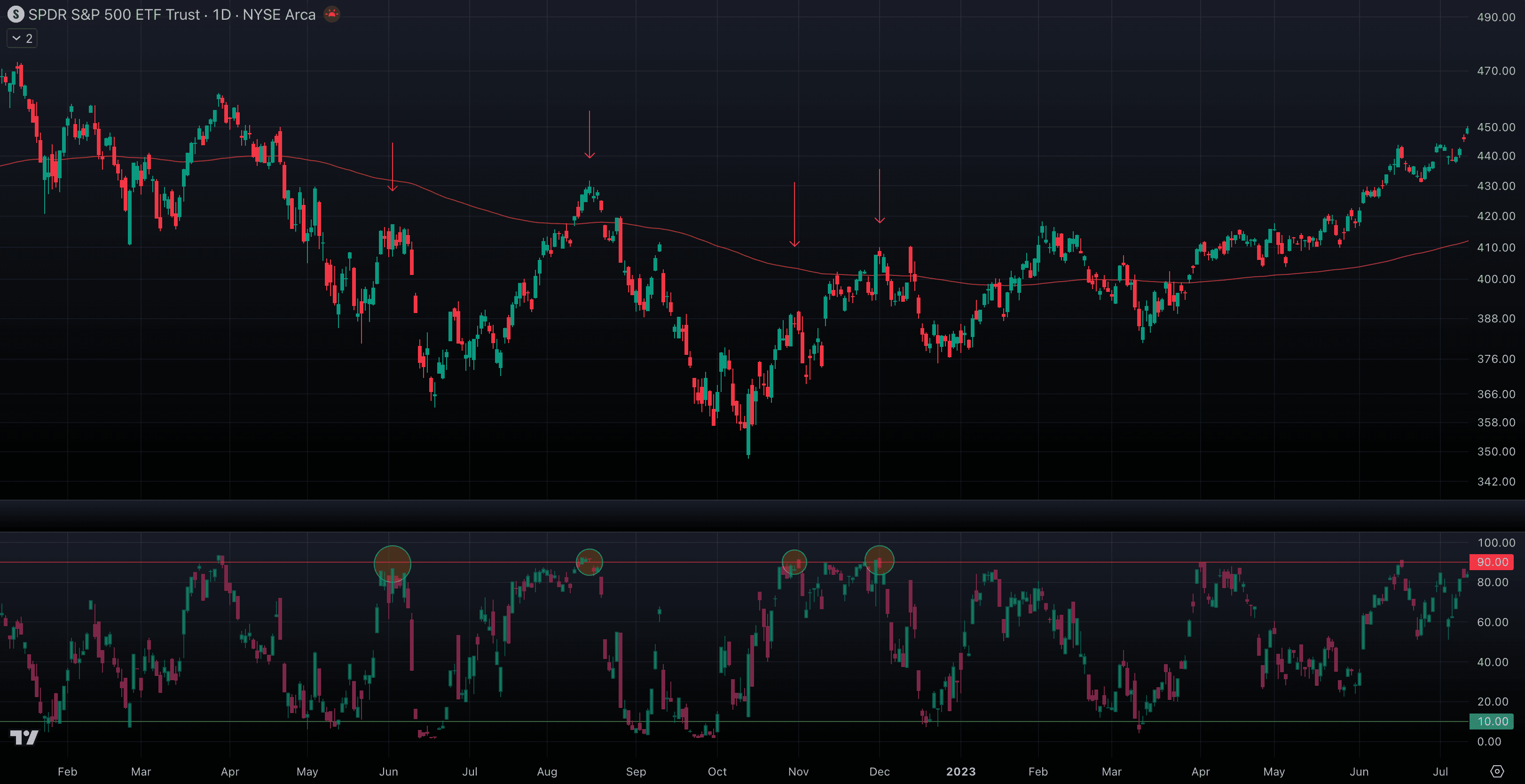
When price breaks through a major level, its role often flips: a support that fails turns into resistance, and a resistance that’s broken often turns into support. This effect is especially strong at all-time highs (ATHs) because they represent the highest price ever reached. These levels carry huge psychological weight — many traders hesitate to buy “at the top,” while others pile in once new highs confirm strength. The same holds true for round numbers (RNs) like 100, 1,000, or 5,000. Market participants naturally anchor around these milestones, and institutions often cluster orders near them. Combined with moving averages (MAs), these levels become zones where sentiment is tested, fear and greed collide, and decisive moves often begin.
SPY D and its ATH in 2024, resistance then turned support
 Psychological levels — like round numbers and all-time highs — act as powerful support and resistance zones. Markets often stall, bounce, or reverse at these points because so many traders recognize their significance. When enough participants are watching the same level, their collective actions create turning points that carry real weight in price movement.
Always mark these levels on your chart before trading. Knowing where they are helps you anticipate potential reactions, avoid chasing price into resistance, and position yourself ahead of key breakout or reversal zones.
Psychological levels — like round numbers and all-time highs — act as powerful support and resistance zones. Markets often stall, bounce, or reverse at these points because so many traders recognize their significance. When enough participants are watching the same level, their collective actions create turning points that carry real weight in price movement.
Always mark these levels on your chart before trading. Knowing where they are helps you anticipate potential reactions, avoid chasing price into resistance, and position yourself ahead of key breakout or reversal zones.
QQQ and its ATH in 2025, same story here
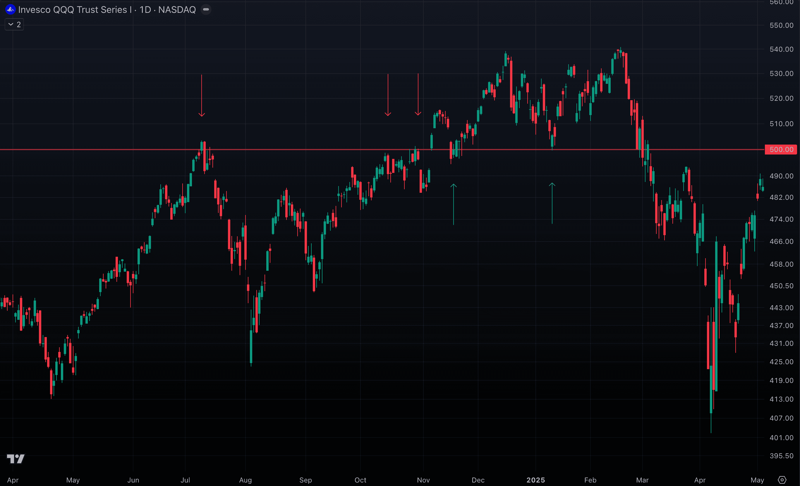
 Studies show that more than 70% of traders cluster their buy or sell orders around round numbers like 00 or 50. This creates powerful support and resistance zones that consistently influence price movement. The effect isn’t just anecdotal — it’s backed by decades of research and trading data from both major financial institutions and academic studies. In short, round numbers really do act as psychological anchors in the market.
QQQ and its 500 level
How Do We Trade These Levels?
- Before the Breakout: All-time highs (ATHs) and round numbers (RNs) often act like magnets for price moving up toward them, but they can also serve as resistance. If you’re already in a trade as price approaches one of these levels from below, treat it as a potential exit zone to lock in profits (or part of it).
- After the Breakout: Once price breaks above an ATH or RN, there’s a strong tendency for it to pull back and retest that level. If the retest holds, that zone often flips from resistance into support. This creates a high-probability entry opportunity to join the new trend.
Average True Range (ATR)
Markets don’t just move up or down — they also move fast or slow, with stretches of calm followed by bursts of volatility. This difference in volatility changes how trades should be managed. In a calm market, price might drift only a little each day, so tight stops can work. In a volatile market, intraday swings are much wider, and using the same tight stops would get you knocked out over and over — even if the overall trend stays intact. That’s where the ATR (Average True Range) comes in. Developed by J. Welles Wilder Jr. in 1978, ATR measures how much price typically fluctuates over a given period, without caring about direction. Think of it as the market’s “breathing pattern.”
Formula: True Range (TR) = the greatest of:
- (High – Low)
- |High – Previous Close|
- |Low – Previous Close|
ATR is then the average of these TR values over n periods (commonly 14). For example, a 14-day ATR tells you the average daily swing over the last two weeks. Why It Matters
- ATR reveals the market’s “normal” move size. A higher ATR means more volatility and risk per trade; a lower ATR means calmer, tighter moves.
- We use ATR to set stop losses at logical levels. For example, placing a stop 1x or 2x ATR away from our entry (at a moving average, all-time high, or round number) let us ride out normal fluctuations while still protecting against major reversals.
- But remember: ATR only tells you how far price can swing without invalidating the setup. To avoid being shaken out by intraday wicks and noise, we require the price to actually close (the daily or weekly candle) beyond that ATR-based level before treating it as a true break.
To simplify this process, we’ve built a free TradingView indicator so you can easily read ATR values and apply them directly to your stop levels — no manual calculations needed. https://www.tradingview.com/script/RCnCU9qR-ATR-Dashboard/
Why Wait for the Close?
- Filter Out Noise: Price can dip below your stop during the session and snap right back. If you act on those intraday wicks, you risk exiting a trade that could have been a winner.
- Stronger Confirmation: A true close below your stop level confirms that support has actually broken, making the signal more reliable.
- Avoid False Breakouts: Many “fake moves” briefly pierce key levels without follow-through. By waiting for the close, you avoid being tricked by short-term volatility.
In our framework, these are treated as “soft stops” — levels we mark on the chart and monitor closely, rather than hard stop orders placed in the system. This gives us the flexibility to wait for the close and make deliberate decisions, instead of being prematurely stopped out by market noise.
Turning the Framework into Action
Now it’s time to take the tools and concepts we’ve built so far and turn them into a clear, executable system. A good trading strategy isn’t about predicting the future — it’s about defining rules that keep you consistent, disciplined, and protected no matter what the market does. By following this framework, you’ll always know exactly what to do — from when to enter, to how much to risk, to when to step aside. Every viable strategy needs to cover these core components:
- Entry Rules — Clear, objective conditions that tell you exactly when to get in. These remove guesswork and emotions, so any trader following the rules would take the same trade.
- Exit Rules — Predefined plans for both taking profits and cutting losses. Stops and targets should be set before you enter, so you’re never making big decisions in the heat of the moment.
- Position Sizing — Guidelines for how much capital to risk on each trade. This prevents any single trade from doing serious damage to your account.
- Timeframe Alignment — Your analysis, entries, and holding periods should match. If you’re trading the daily chart, manage it daily; if you’re trading the weekly, manage it weekly.
- Capital Protection (Optional) — Extra tools like break-even adjustments or trailing stops that help lock in gains while keeping risk small.
With these pieces in place, you have the framework for a system that can be repeated trade after trade — without relying on emotion, hunches, or news headlines.
Select Your Timeframe
You’ll mainly trade off either the daily chart or the weekly chart, and each comes with trade-offs:
- Daily Chart — More signals, tighter stops, shorter trades (days to weeks). Great for catching swings but noisier, may require more entry attempts. Requires active monitoring at the open and near the close of each daily trading session.
- Weekly Chart — Fewer but higher-quality signals, wider stops, longer trades (weeks to months). Better for big trends, smoother overall, but demands patience. You only need to check setups at Monday’s open and Friday’s close.
Even if you trade the daily, you should still respect weekly levels since they carry more weight with institutions. Just remember: daily means faster entries and tighter risk; weekly means slower signals and bigger risk. Blending both can be powerful — as long as you adjust your execution and risk management to match.
Entry Rules
- Spot a Strong Trend with Clear Reactions at Key Levels — Look for clean bounces, sharp wick rejections, or consolidations around moving averages (MAs), all-time highs (ATHs), or round numbers. As we covered earlier, the stronger the trend, the cleaner and more reliable these reactions will be. Weak trends often don’t respect these levels.
- Pick Your Level in the Direction of the Trend — Use past price behavior as your guide. If the market has consistently reacted at a certain MA, ATH, or round number, that’s a potential entry zone.
- Moving Averages: You can enter aggressively right at the touch, or more conservatively after seeing a bounce or wick.
- ATHs & Round Numbers: Wait for confirmation, like a clear candle pattern (candle wicks), to avoid false breaks.
- Set Stops & Manage Risk — Always size your trade based on risk. Stops should give price enough “breathing room” using ATR (Average True Range):
- 20 MA → Stop at MA level minus 1 ATR
- 50 or 100 MA → Stop at MA level minus 1.5 ATR
- 200 MA → Stop at MA level minus 13ATR
- ATH or RN → Stop at MA level minus 1.5-2 ATR
- Use Soft Stops — These are levels you mark and monitor on the chart, not hard stop orders. Only act if the price closes beyond your stop level. This avoids getting shaken out by intraday noise and wicks.
Exit Rules
- Use a Moving Average as Your Guide — In a strong bull trend, a confident close below the 20 EMA/SMA can serve as your signal to exit.
- Respect Key Levels — Prior all-time highs (ATHs) and round numbers often act as resistance. If price nears these levels, it’s smart to consider taking partial or full profits.
- Watch Candle Closes — A long red candle with no lower wick often signals heavy selling and profit-taking. That’s a good time to tighten stops or exit.
- Check Market Context — For ETFs or stocks highly correlated with the market, use the Market Components Analysis System (covered later). This helps you judge if it’s just a minor pullback worth holding through, or a broader weakness signaling an exit.
Sizing Rules
Your position size should always be tied to the size of your overall portfolio. A good starting point is risking no more than 5% of your total capital per trade — and if you’re new, start even smaller until you build confidence.
- Daily Chart Trades: Risk is usually about 5–10% of your position size (distance from entry to stop). Stops are tighter here, so losses stay smaller.
- Weekly Chart Trades: Risk is usually about 15–20% of your position size since weekly ATR-based stops are wider. These trades are less frequent but require more breathing room.
To make this simple, use the calculator link below. Just enter your chosen capital allocation (as a % of your portfolio), along with your entry and stop prices, and it will give you the exact trade size. https://docs.google.com/spreadsheets/d/1A7aFl5NNyIeE-iMFaXkkqwXQ8jWFS6PUbJYnX7AR9mc
Capital Protection
Protecting your capital is what keeps you in the game — it’s the difference between blowing up your account and being around long enough to ride the big trends. One of the simplest and most effective ways to do this is by adjusting your stop once the trade moves in your favor. Here’s how it works: once price moves about 1% in your favor (this is what we use) ****, shift your stop up to your entry price. At that point, you’ve eliminated downside risk — the worst-case scenario is you get stopped out at breakeven. This creates what we call a “free ride”: your capital is protected, but your upside is unlimited if the trend continues. Why is this so important? Because trading is rarely a one-shot game. It often takes several attempts to get into the right move. Some trades will fail quickly, others will chop around. By using capital protection, you make sure small setbacks don’t pile up into big losses. That way, when the real trend takes off, you still have the capital (and the confidence) to take full advantage. This step may feel tedious or unnecessary in the moment, but over the long run, it’s what separates traders who survive from those who burn out. Think of it as your safety net — not glamorous, but absolutely essential.
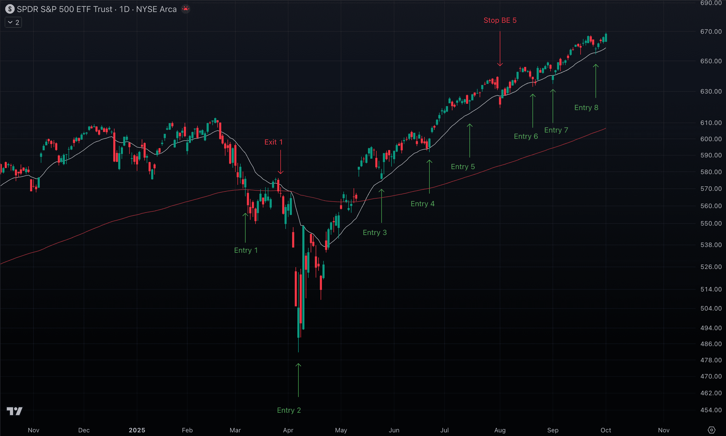
Real Trade Examples
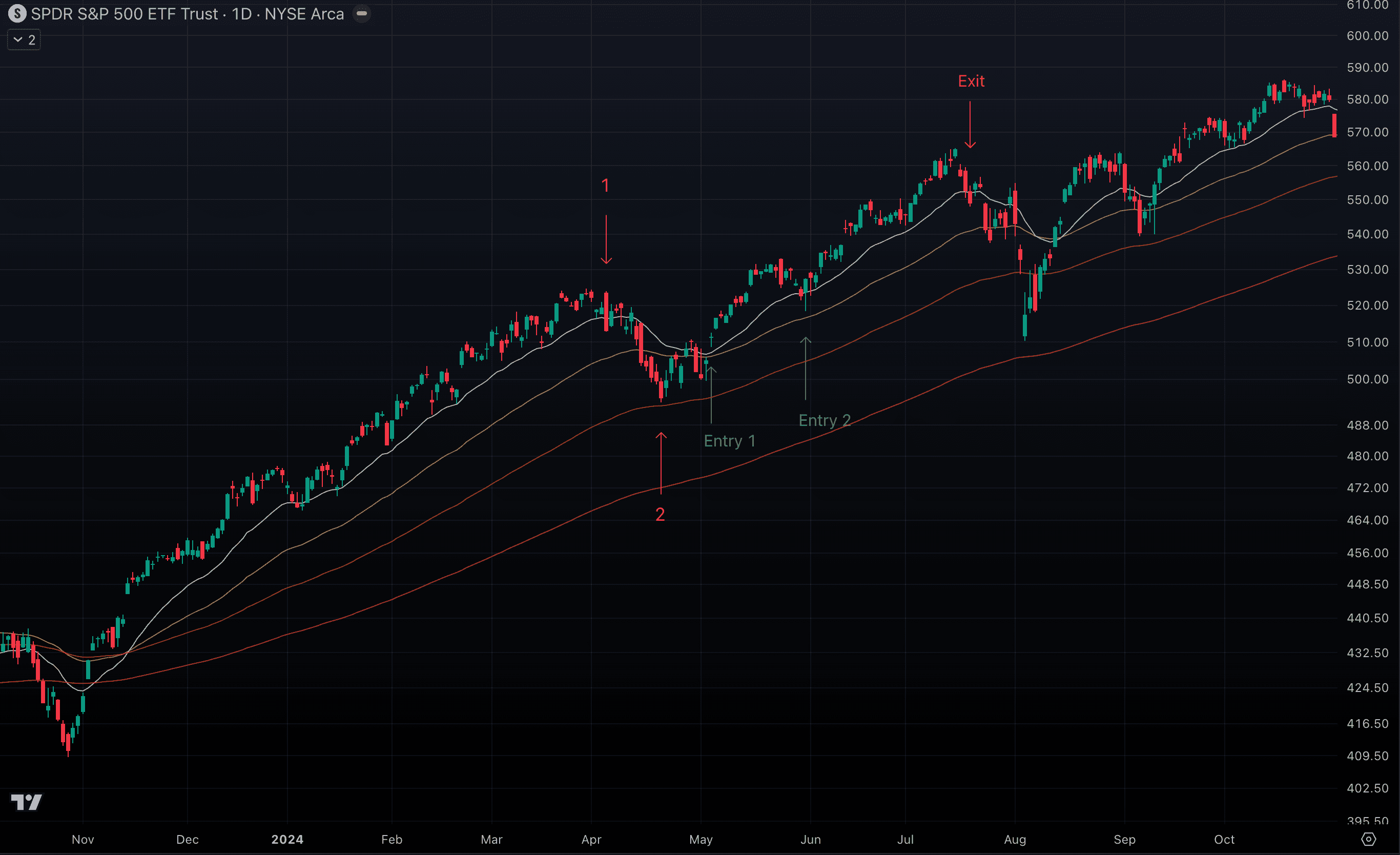
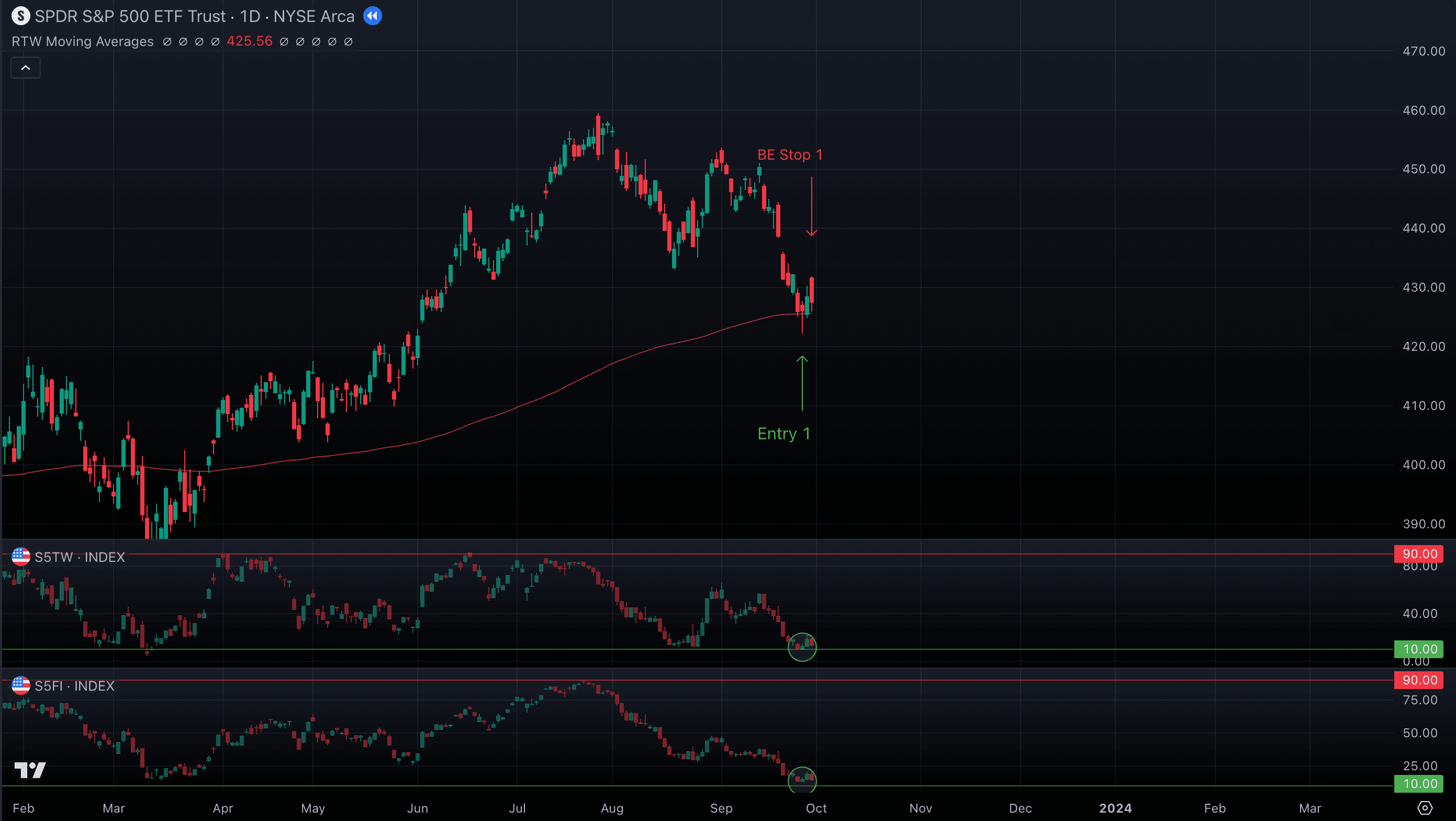
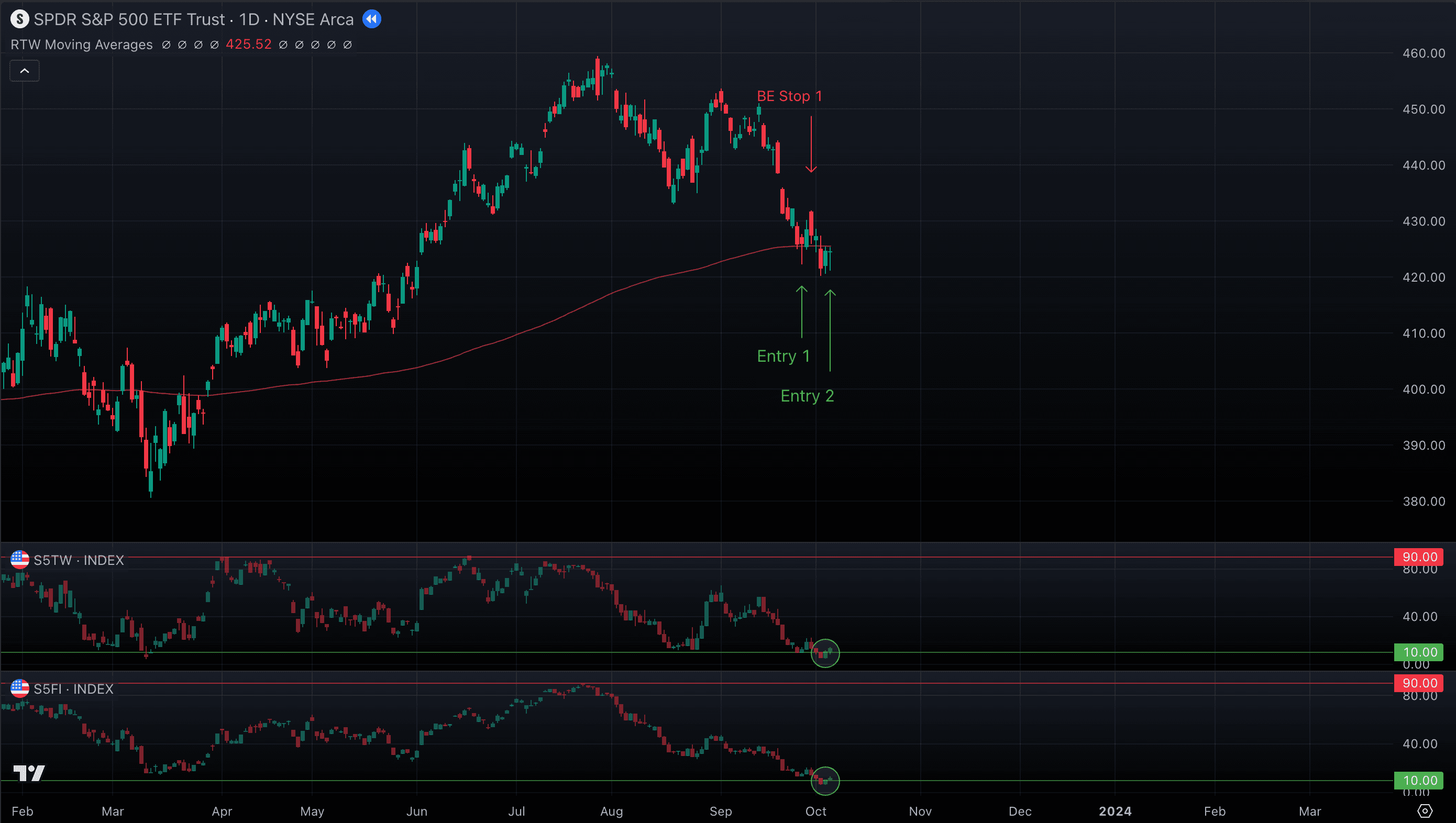
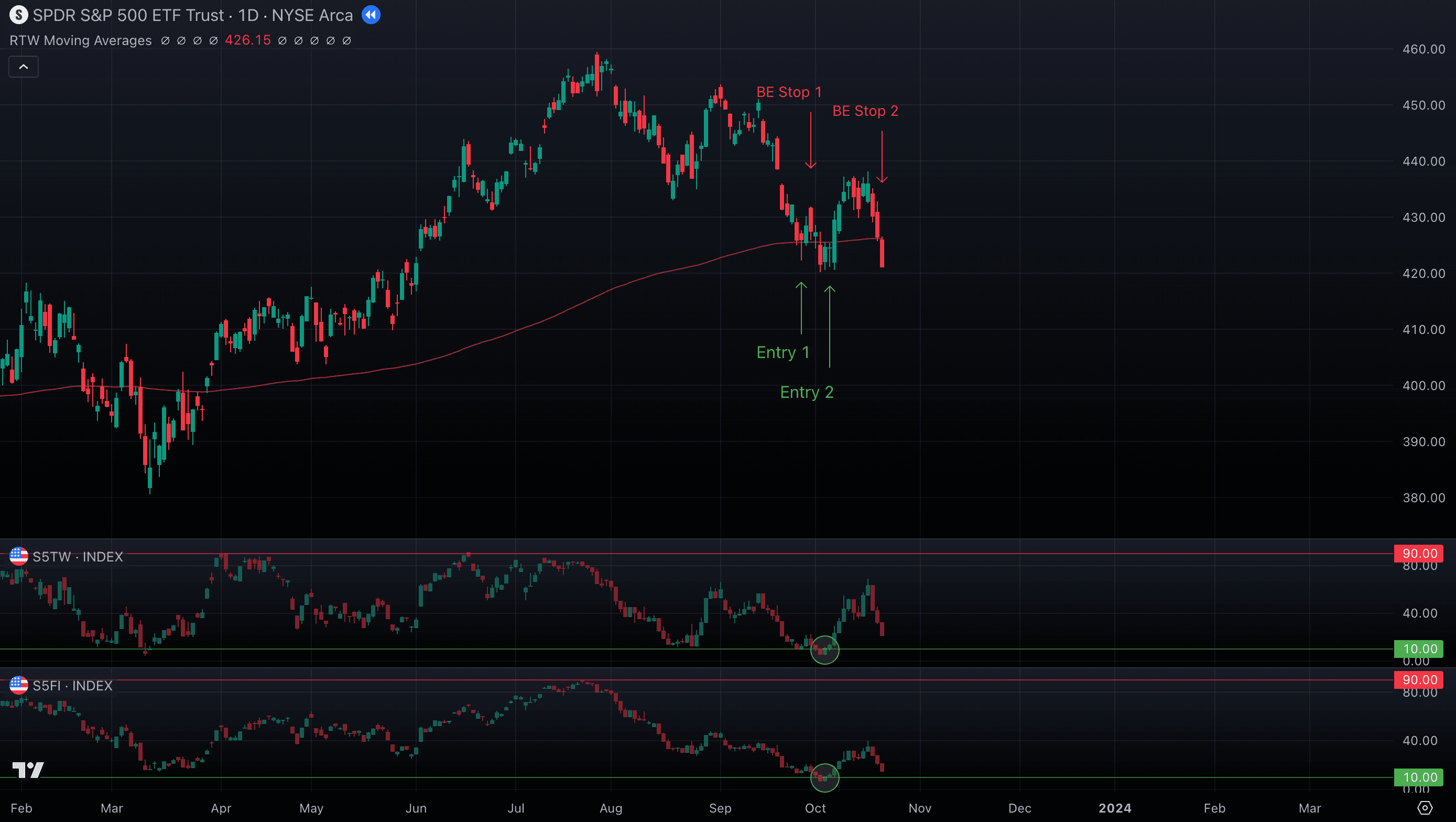
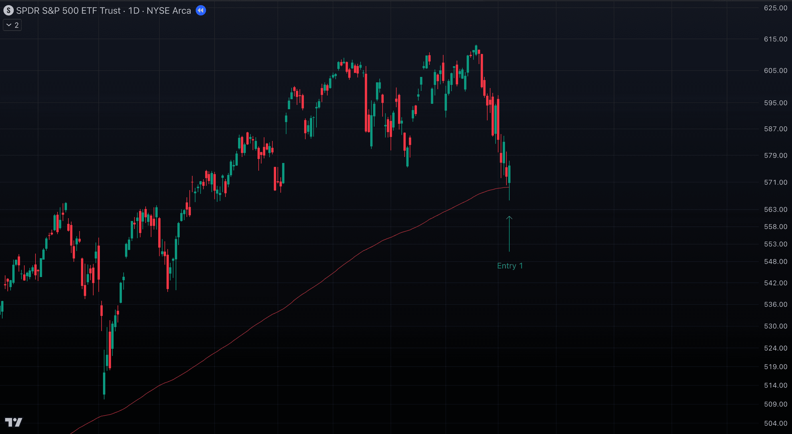
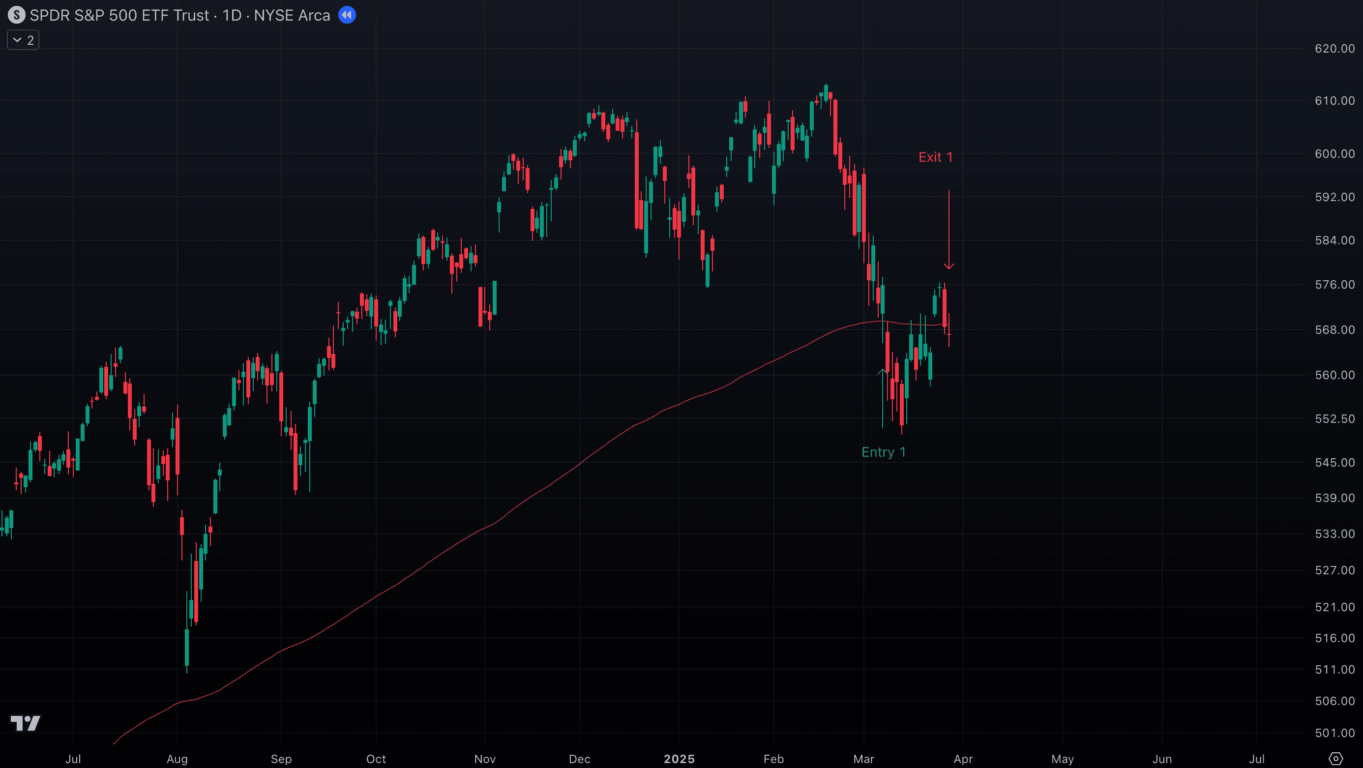
To make the Framework more practical, let’s look at trades we actually took using it. These examples show how moving averages, wick rejections, ATR-based stops, and clear exit signals all come together in real market action: Trade 1 — SPY D
- After a strong uptrend, SPY printed a sharp selloff — a large red candle broke below the 20 EMA (Point 1). That kind of move often signals a shift in sentiment.
- Price then moved sideways, cutting straight through the 50 EMA without reacting — so we ignored that level.
- We were waiting for a test of the 100 MA, but instead SPY bounced earlier (Point 2).
- When we saw a gap and then a wick near the 20 EMA, we entered before the day’s close (Entry 1).
- On the retest of the 20 EMA, a strong green candle with a long lower wick appeared, so we added to the position (Entry 2).
- We closed the trade after three consecutive red candles, with the final one settling below the 20 EMA
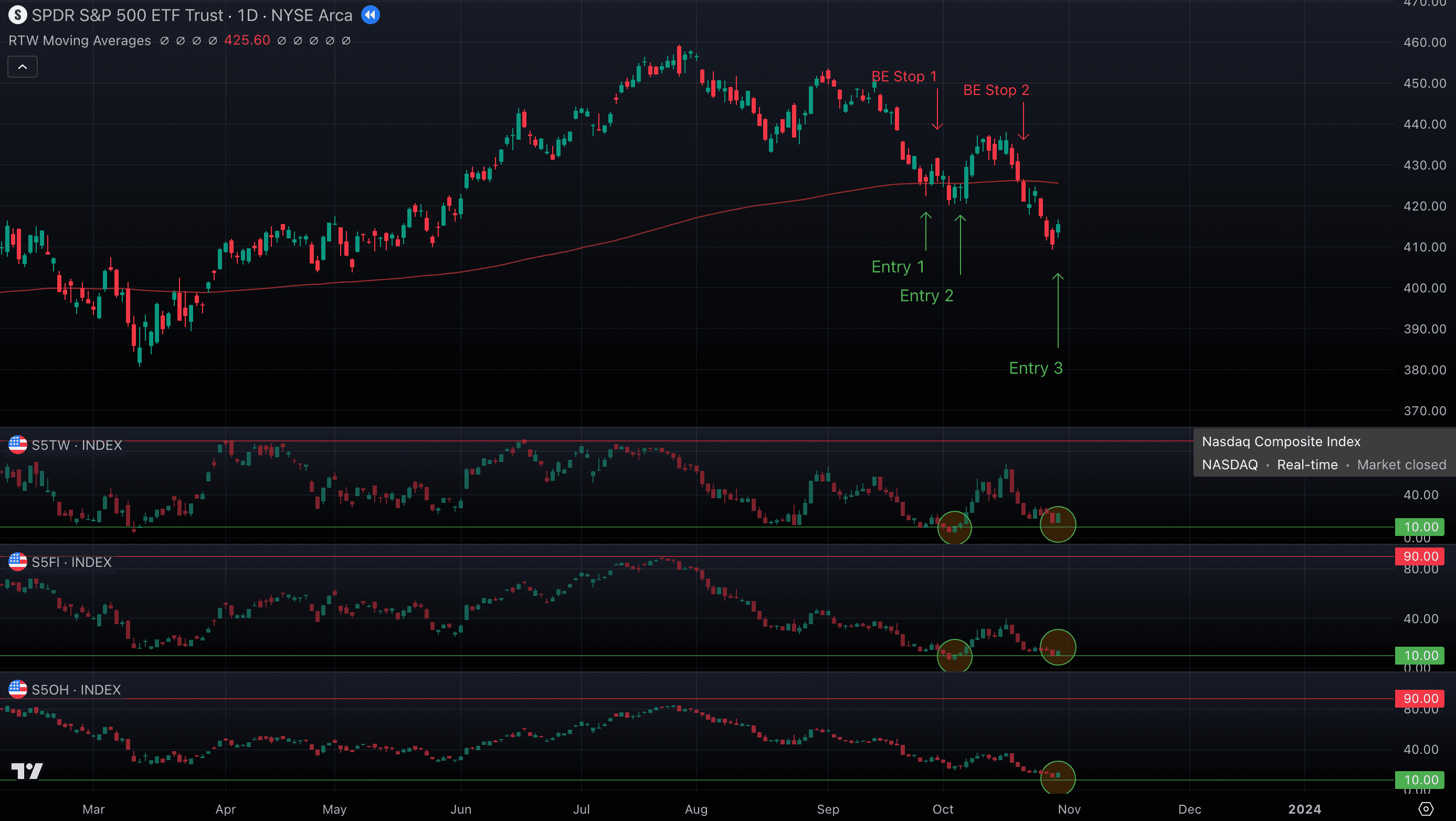
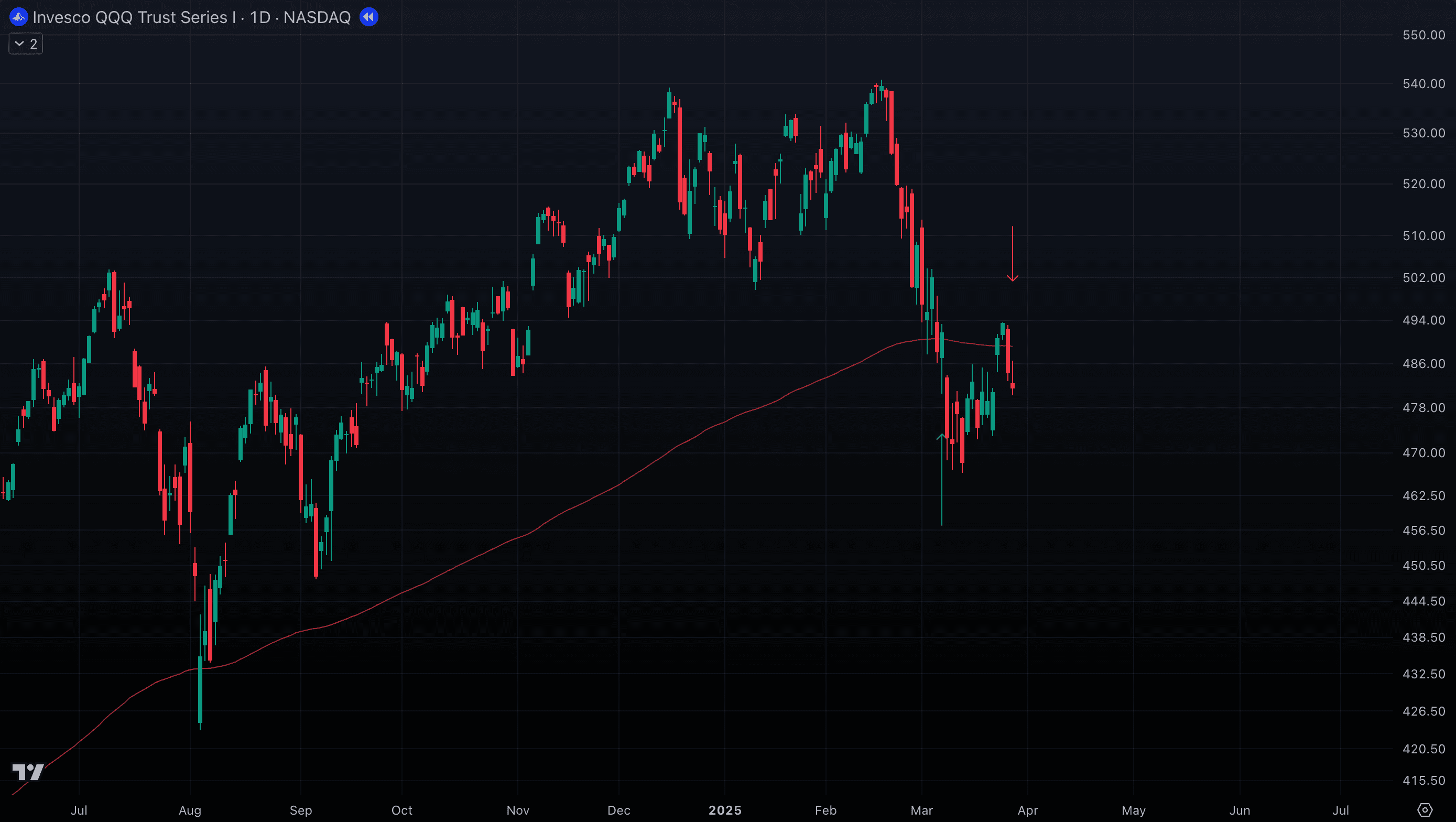
Trade 2 — QQQ (Daily Chart)
- After the April selloff, QQQ dropped to the 200 EMA. The session opened with a sharp gap down, but buyers quickly stepped in, driving price higher and closing with a strong green candle. That was our first signal, and we entered here (Entry 1), placing the stop 2 ATR below the 200 EMA.
- After short rally price gapped up again and broke cleanly through the last major resistance — the 50 MA. We added a second position (Entry 2), using the prior day’s high as the stop (requiring a close below to trigger it).
- We exited both positions when a large red candle appeared, marking the likely start of a correction and signaling it was time to step aside.
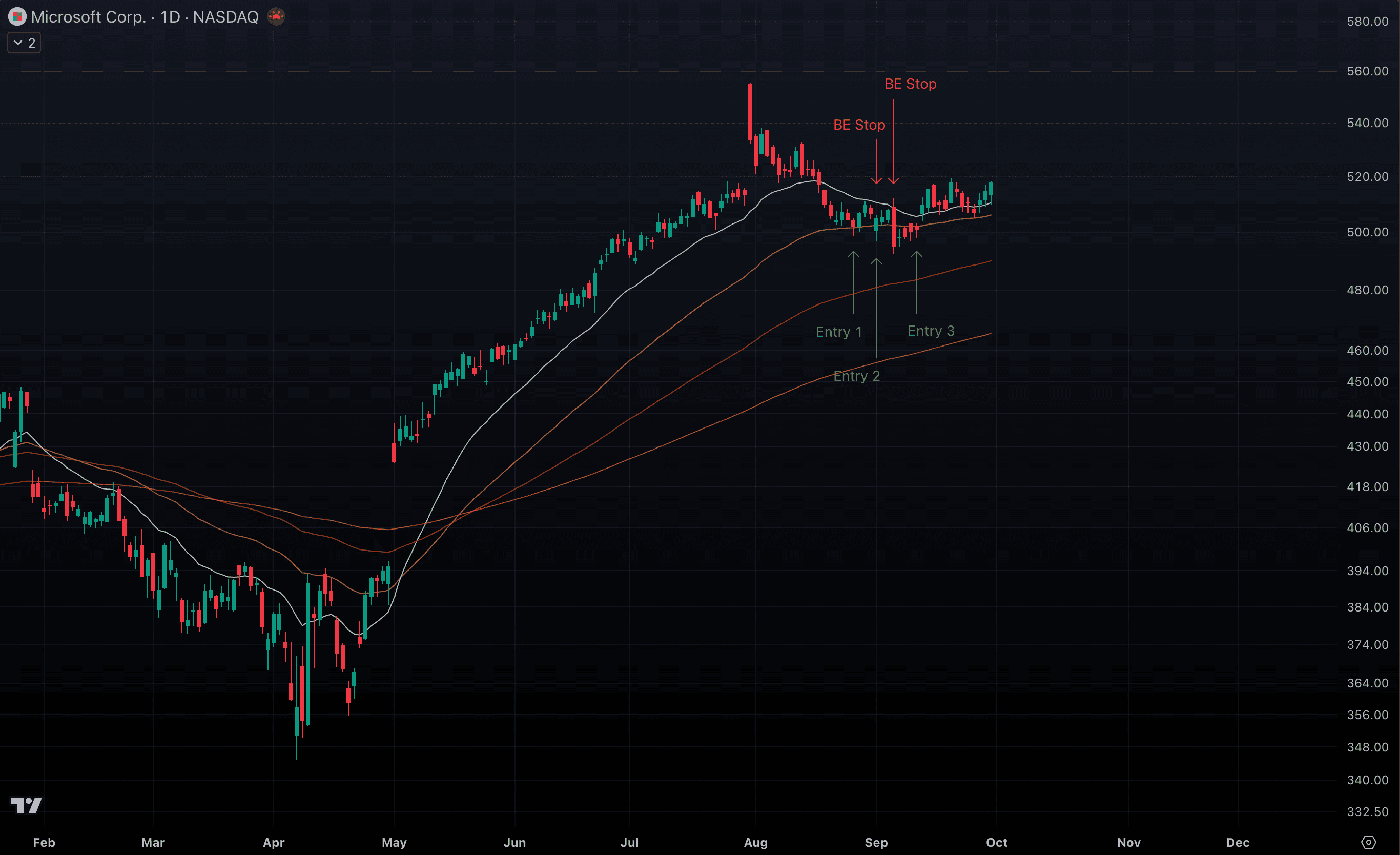
 Trade 3 — MSFT (Daily Chart)
- After breaking through the 500 round number (RN), MSFT pulls back to test this level for the first time. It acts as solid support and sets up a trade opportunity.
- We enter aggressively on the first candle showing a wick rejection at the level, but are stopped out four days later. The position is closed at break-even.
- A few days later, another green candle forms with a wick at the same level. We re-enter, but are again stopped out three days later, closing the position at break-even.
- Four days after that, we observe two strong wick rejections at the level, and we enter once more before the day’s close.
Trading Gaps
In some trades, gaps can serve as entry signals — but only under very specific conditions. The gap must break through a key resistance level (such as a MA, ATH, or RN) and then continue with strong bullish momentum. In these setups, we enter the trade right when the market opens and place the stop just below the previous day’s high, and price must close below that level to trigger it.
Be Ready at the Close
Confirmation candles only form in the last 15–30 minutes of the session. That means you must know in advance which setups you’re ready to trade. If confirmation appears, you’ll need that time to act and place the order without hesitation.
Earnings Reports
When trading individual stocks, be extremely careful about holding through earnings announcements. These events bring sharp volatility and completely unpredictable gaps. To handle this risk, either give your trade enough buffer to absorb the potential swing or exit beforehand and wait for clarity.
Break-Even Stops
Price often comes back to your entry point and triggers break-even stops. While this can feel frustrating, moving your stop to breakeven after a 1% gain is essential for protecting capital. More often than not, it will take multiple attempts to secure a position — and that’s perfectly fine.
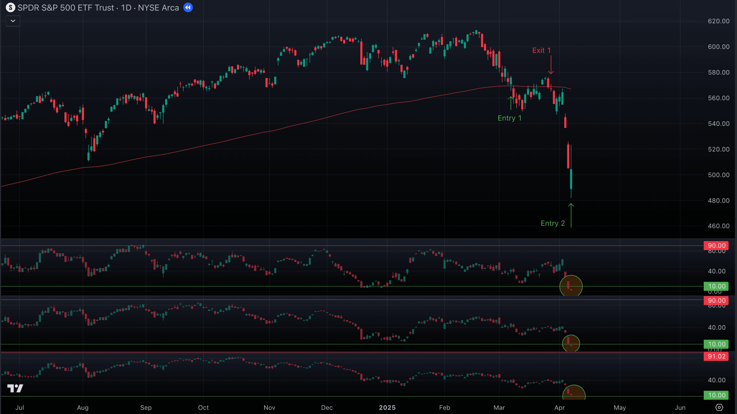
Market Components Analysis System
In this chapter, we’ll introduce an advanced market analysis system that goes far beyond simply watching the S&P 500. Instead of looking at the index in isolation, we break it down into its key components and run them through the Technical Framework. By applying the same tools you’ve already mastered — moving averages, all-time highs/round numbers, and ATR — we uncover how each part of the market interacts with critical levels. This approach gives you a real edge: you can see where strength is building, where weakness is creeping in, and whether the S&P 500’s trend is truly supported by its foundations. In short, it’s how you stop guessing and start reading the market’s internal engine to know where it’s really heading.
Why Market Direction Matters
Before making decisions at the individual trade level regardless of whether you trade large ETF or specific stock, you need context from the broader market. Knowing the likely direction of the S&P 500 helps you align your actions with the bigger trend.
- Exit: If the market is showing clear signs of weakness, it’s often better to close or reduce exposure rather than fight against broad selling pressure.
- Hold: If direction is uncertain, staying patient and waiting for confirmation prevents overreacting to noise.
- Accumulate: When the market is trending strongly higher, it creates the best conditions to add positions with confidence, knowing that institutional flows are working in your favor.
In short, understanding market direction acts as a compass: it tells you when to step aside, when to be cautious, and when to press your advantage. Without it, even good setups can fail simply because they’re moving against the tide.
Components: Core US Market Indices
Think of it like watching the gears of a machine: the S&P 500 is the engine, but these indices are the cogs and pistons that drive it. By analyzing their interactions, you can almost feel the market breathing — sensing when pressure is building, when it’s releasing, and when a larger move is about to unfold.
- QQQ – Nasdaq 100. Tracks the 100 largest non-financial companies listed on the Nasdaq, heavily tilted toward technology (AAPL, MSFT, NVDA, META, AMZN, etc.). Tech stocks carry the highest weighting in the S&P 500, so QQQ is often the leading driver of S&P moves. If QQQ is surging or breaking key levels, the S&P usually follows.
- IXIC – Nasdaq Composite. Includes over 3,000 Nasdaq-listed companies, ranging from mega-cap tech to smaller growth names. It reflects the broader tech ecosystem, not just the giants in QQQ. A divergence between IXIC and QQQ can signal whether the rally is concentrated in big names or supported by the wider market. This matters because broad participation strengthens S&P 500 trends, while narrow leadership often warns of fragility.
- NYA – NYSE Composite Index. Represents all common stocks listed on the New York Stock Exchange (over 2,000 companies), spanning U.S. and international firms. It’s a holistic market measure with significant overlap to the S&P 500 but also broader exposure. NYA strength confirms that momentum extends beyond the top names and reflects institutional flows across the market.
- DIA – Dow Jones Industrial Average. Tracks 30 blue-chip U.S. companies with a heavy tilt toward industrials, manufacturing, and legacy leaders. Although narrower and price-weighted, DIA often reflects traditional economy strength versus the tech-driven Nasdaq. When DIA confirms moves in SPY, it suggests alignment across sectors. When it lags, it highlights a market driven by tech alone — a condition that can make the S&P 500 trend more fragile.
- RSP – Invesco S&P 500 Equal Weight ETF. Gives every S&P 500 stock the same influence, unlike SPY which is weighted by market cap. RSP is critical because it shows whether the average S&P 500 stock is participating or if a handful of mega-caps are carrying the index. A strong SPY but weak RSP indicates narrow leadership; when both are strong, the rally is broad and sustainable.
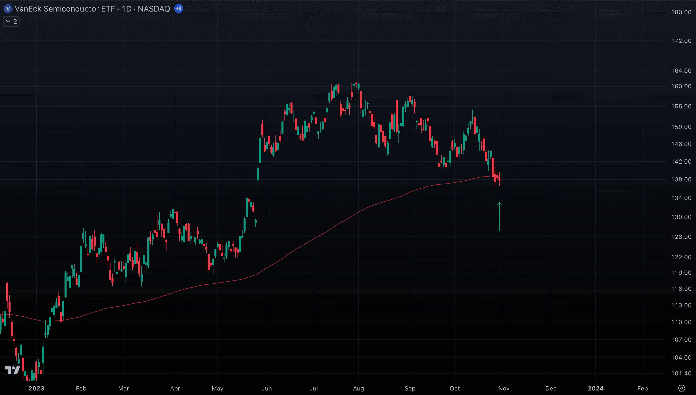
- SMH – VanEck Semiconductor ETF (semiconductors, high-growth leaders). Semiconductors are the backbone of modern technology — powering everything from AI and cloud computing to smartphones, EVs, and industrial automation. SMH tracks the biggest U.S.-listed chipmakers like NVIDIA, AMD, Intel, TSMC ADRs, and Broadcom, many of which also rank among the largest S&P 500 components. Because these companies sit at the center of innovation and capital flows, SMH has become a major force within the S&P 500, often driving broader index performance in the same way tech (QQQ) does.
Rotational Forces
Often, after the market has risen strongly on QQQ (tech) leadership, those stocks need to breathe out toward their nearest short-term MA (10 or 20). During these pauses, capital frequently rotates into DIA and RSP — the broader market — which helps keep SPY afloat. These rotations are a sign of a healthy, well-paced trend, where leadership shifts across sectors instead of overheating in one place. Let’s now look at the examples below to see how these key levels across the major indices align with what we observe in SPY. This way, you’ll see how strength or weakness in tech, industrials, equal-weight breadth, or the broader market often foreshadows or confirms the moves we track in the S&P 500.
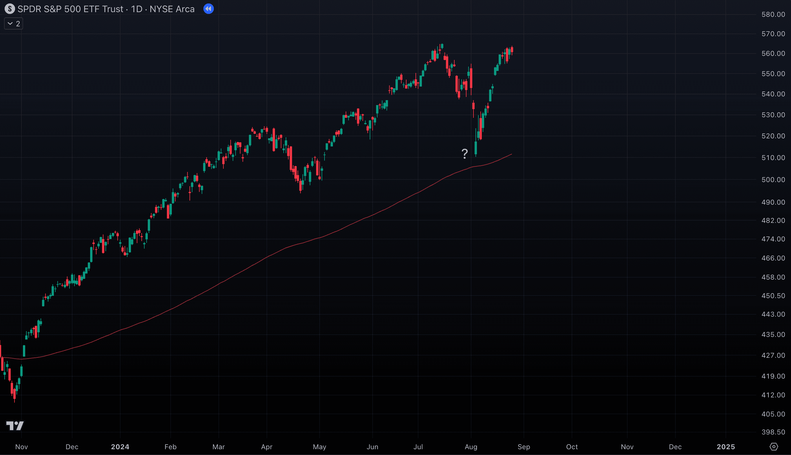
SPY bounce during the August 2024 dip — what has happened here?
But look at the QQQ and its 200 EMA D

IXIC and its 200 EMA D
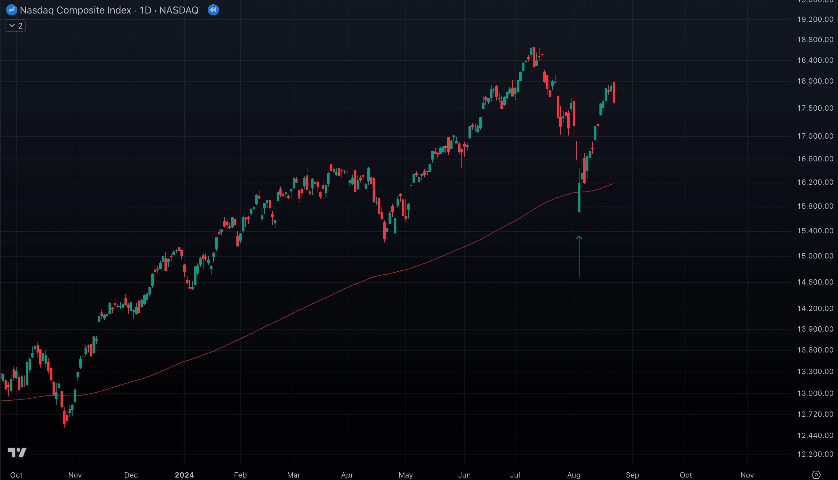
What looks like SPY bouncing “in mid-air” is really QQQ and NYA hitting their 200 EMA daily. Tech leadership (QQQ) or broad market breadth (NYA) provides the hidden support, and SPY follows.
Now, what about these two SPY bounces in 2020?

Look at the equal-weighted S&P 500 (RSP). What do you see?

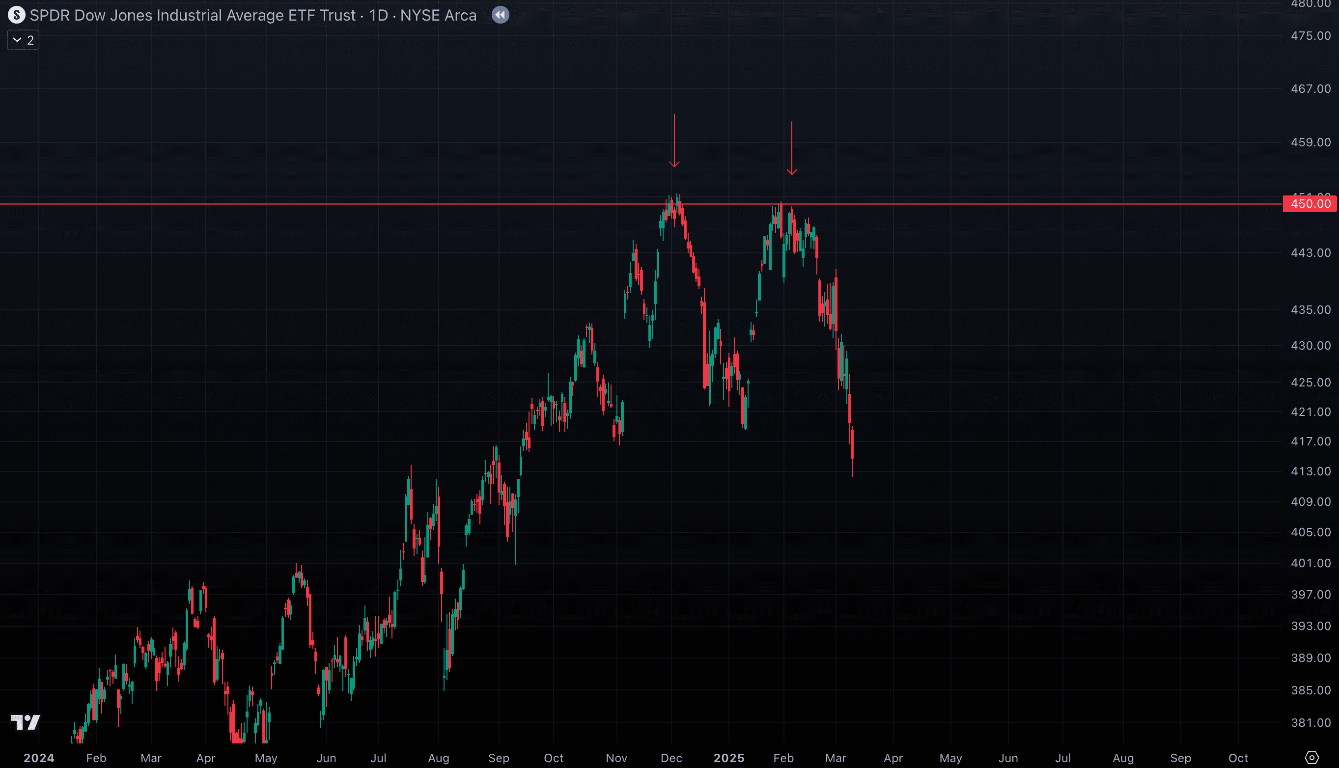
Now look at SPY hitting “invisible” resistance in December 2024 and February 2025
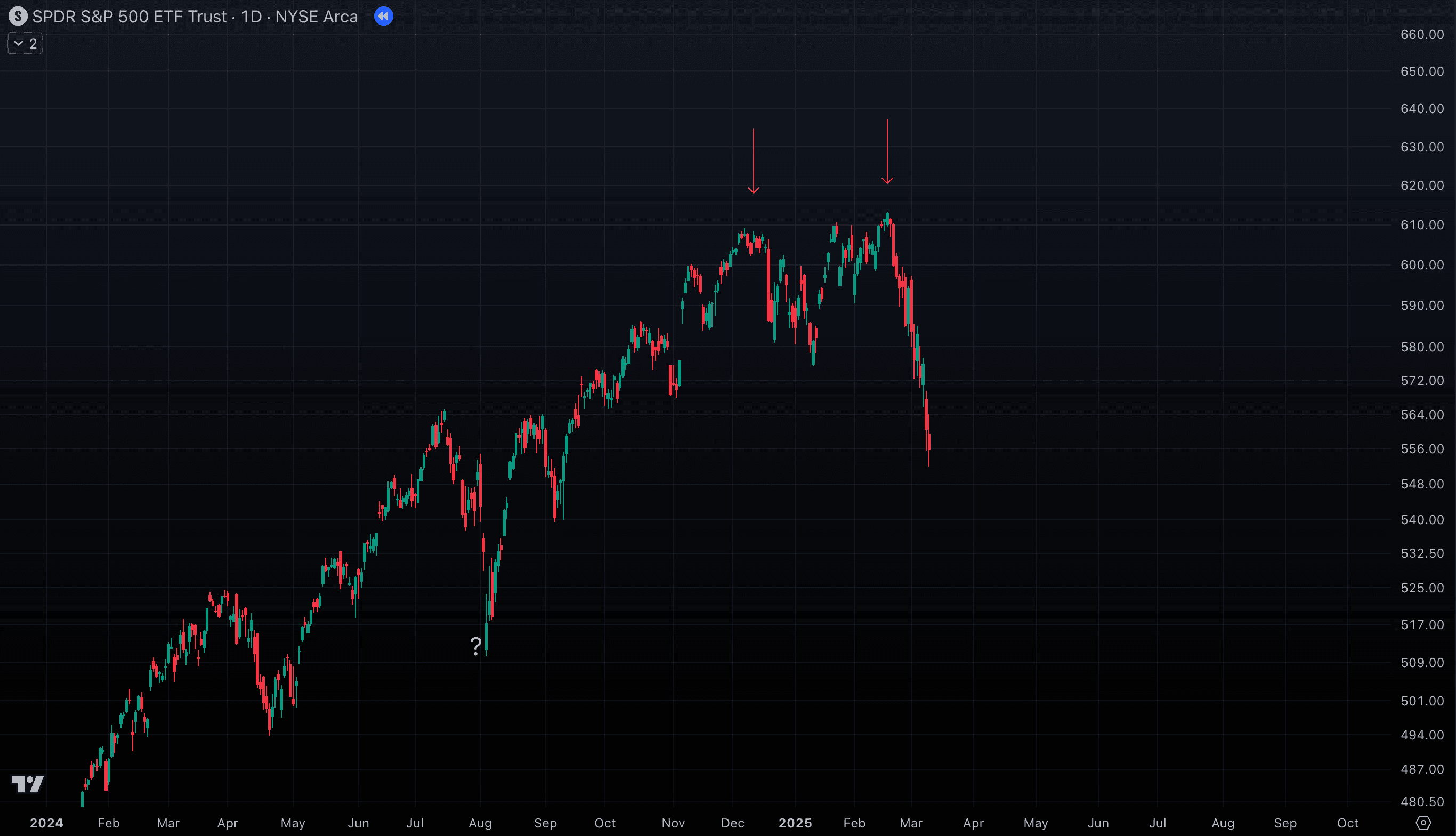
Both moments coincide with DIA struggling to break through the 450 round number (RN) level
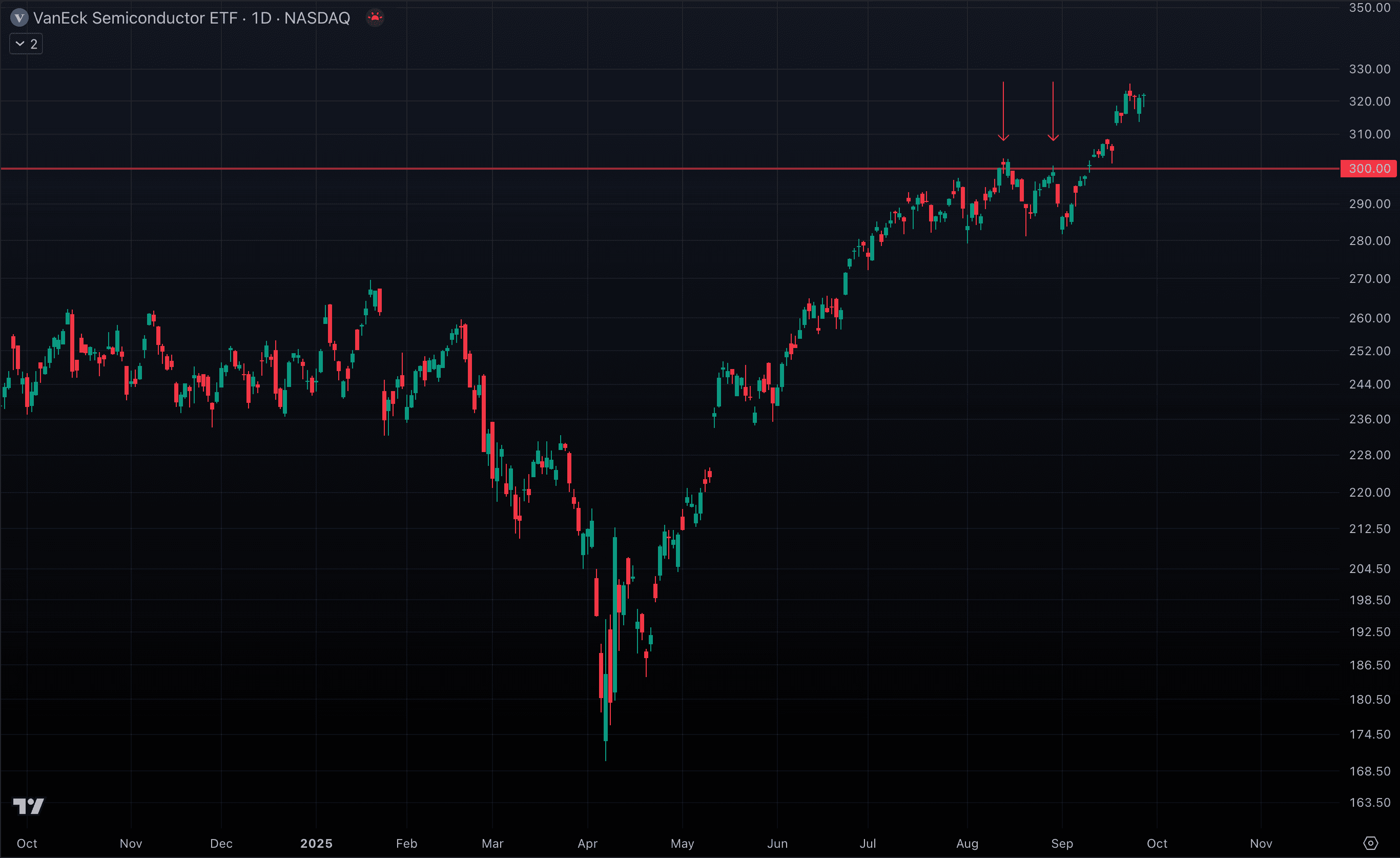
Or these seemingly unexpected short SPY pullbacks in August 2025?
But look what happened with SMH and its 300 level at this time
Hopefully, you’re starting to see how the different components of the market — tech through QQQ, breadth through RSP and NYA, industrial strength via DIA, or sector leadership from SMH — all feed back into SPY, the proxy for the S&P 500. By analyzing these indices with the Technical Framework, you can spot when a key component hits an important level — and then decide whether to trade that index directly or trade SPY itself, using the strategy built around that signal. This gives you a clearer view of the market’s inner workings, helping you uncover hidden supports, resistances, and sector rotations that often drive SPY’s moves before they’re obvious on its own chart. With that foundation in place, it’s time to add another powerful piece to our Market Components Analysis System — Futures.
Components: Futures
One of the biggest limitations of trading equities (stocks and ETFs) is that most of the action happens when the market is closed. Corporate earnings, central bank announcements, geopolitical shocks, and overseas market moves often land outside U.S. trading hours. By the time the stock market opens, much of the reaction is already “priced in,” leaving retail traders a step behind. This is where futures come in. Originally designed to lock in prices for commodities like wheat or oil, futures have evolved into a cornerstone of modern financial markets. Unlike stocks, which only trade during fixed hours, index futures trade almost 23 hours a day, following the global flow of capital across Asia, Europe, and the U.S. They don’t represent company ownership — instead, they are standardized contracts tied to the expected future price of an index. For traders, this makes futures invaluable. They provide a real-time view of market sentiment when the cash market is closed and offer early clues about where momentum might flow once equities reopen. Watching futures helps you anticipate overnight gaps, confirm trend continuation, and gauge the true tone of the market before the opening bell. In our framework, we’ll focus on just a handful of key contracts — the ones most directly linked to the indices that drive the S&P 500 and the broader U.S. market:
- ES1! — S&P 500 Futures. Tracks the broader U.S. market through the S&P 500 index. ES is the most liquid futures contract in the world and serves as the direct futures equivalent of SPY.
- NQ1! — Nasdaq 100 Futures. Focused on the tech-heavy Nasdaq 100. Because technology makes up a large share of the S&P 500, NQ futures often act as an early leader for market direction and closely mirror QQQ.
- YM1! — Dow Jones Industrial Futures. Represents the Dow Jones 30, a basket of blue-chip U.S. industrial companies. YM futures move in step with DIA and highlight rotations into or out of traditional sectors.
Let’s now look at examples of how futures price action can set the tone for SPY during regular trading hours.
In March 2023, DIA and SPY gave no clues about what was about to happen.


But looking at the YM1! (the DIA futures equivalent), you could clearly see how the price was consolidating near 200 SMA D for a week straight, with long wicks signaling buyers’ willingness to hold that level.
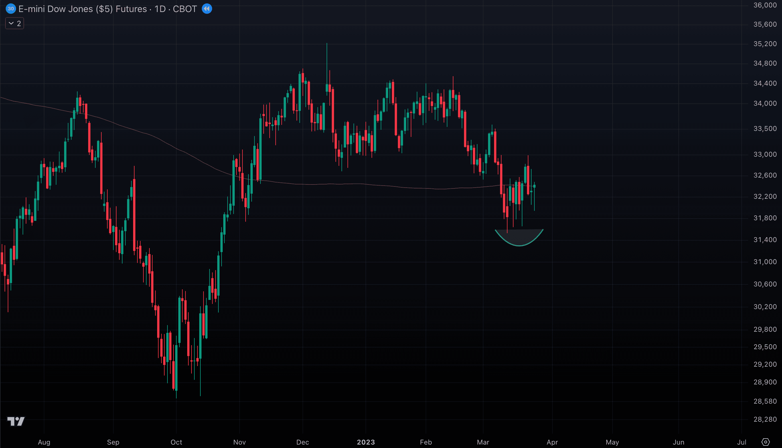
What happened next? YM1! rallied higher, and SPY followed along.

How did we trade this? We opened a long position on SPY by using the setup on YM1!, with a tight stop if price closed below those wicks. Futures reveal the market’s true sentiment by capturing the moves that unfold while equities are asleep. They show how global capital positions itself and where key levels are being tested — insights you’d completely miss if you only watched the main session. That’s why futures are an essential part of the Market Components Analysis System. Now, let’s turn to something even more powerful: Market Breadth Indicators — tools that, when read correctly, provide some of the clearest signals about market strength and turning points.
Components: Breadth Indicators
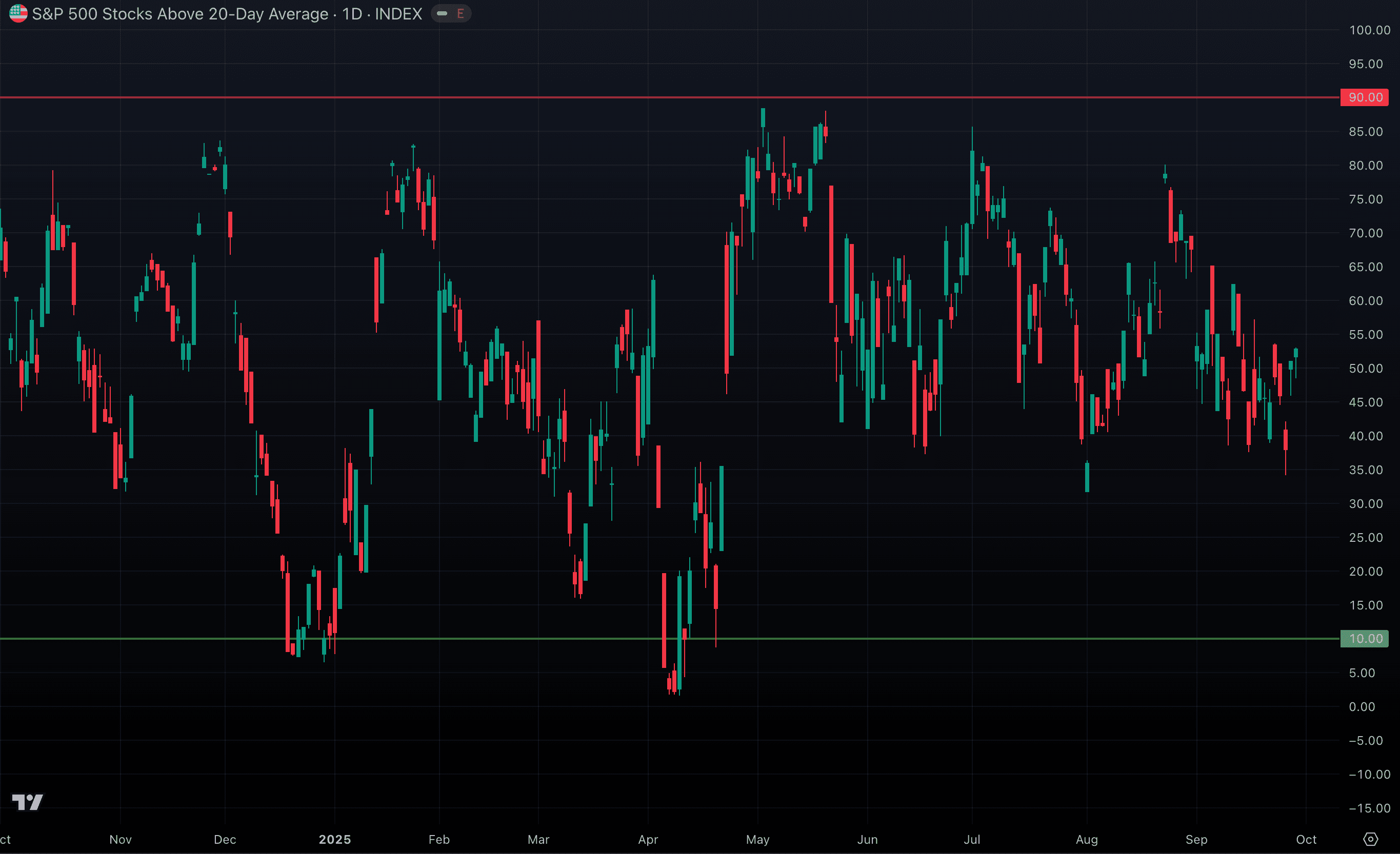
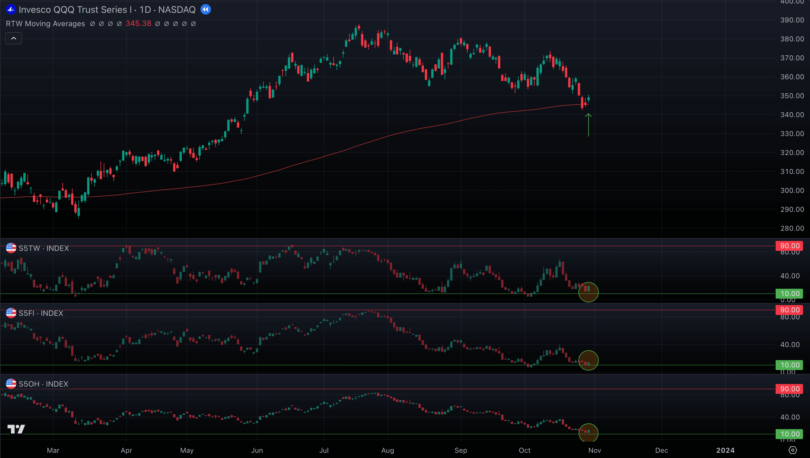
When it comes to indexes like S&P 500 or NASDAQ, sometimes a handful of giant companies (like Apple, Microsoft, or Nvidia) drag the whole index higher, even if most other stocks are falling. To really understand the health of the market, you need to look at breadth: how many stocks are actually participating in the move. That’s what these indicators show. Each one measures the percentage of stocks within the index (e.g., all 500 companies in the S&P 500) that are trading above a certain moving average (like the 20-day, 50-day, 100-day, or 200-day). So if 250 stocks are above their 20-day moving average, the reading is 50%. If nearly all 500 are above it, the indicator is close to 100%. Think of these as “participation meters.” The more stocks above those key averages, the stronger and healthier the trend. If only a few leaders are carrying the index while breadth weakens, the rally is fragile. Don’t worry if this sounds confusing right now — we’ll walk through clear, real-world examples. First, let’s see how the S5TW chart may look in practice, tracking the percentage of S&P 500 stocks above their 20-day moving average. By definition, this value can never fall below 0% (no stocks above the average) or rise above 100% (all stocks above it). Instead, it constantly fluctuates between these two limits, rising and falling with market momentum. That bounded movement makes it an oscillator — swinging between periods of broad strength and broad weakness.
S5TW D chart

On its own, there’s nothing unusual here — the line just swings up and down, with each candle showing the high, low, open, and close of the percentage of S&P 500 stocks above their 20-day moving average within that day. But things get interesting once we add vertical markers at the extremes: 90% at the top and 10% at the bottom. These thresholds help us spot when participation is unusually high or unusually low across the index.
S5TW D with 90% and 10% levels on the chart
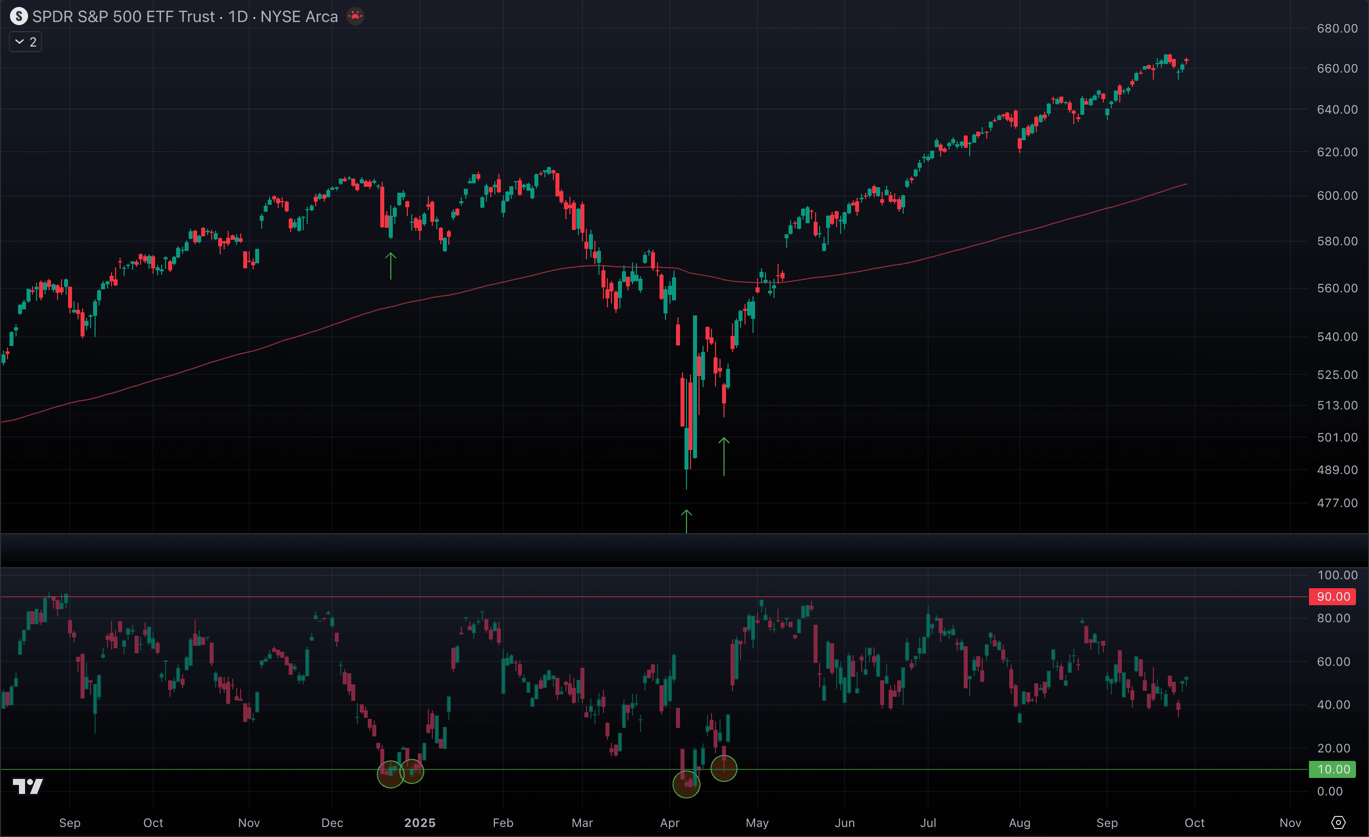
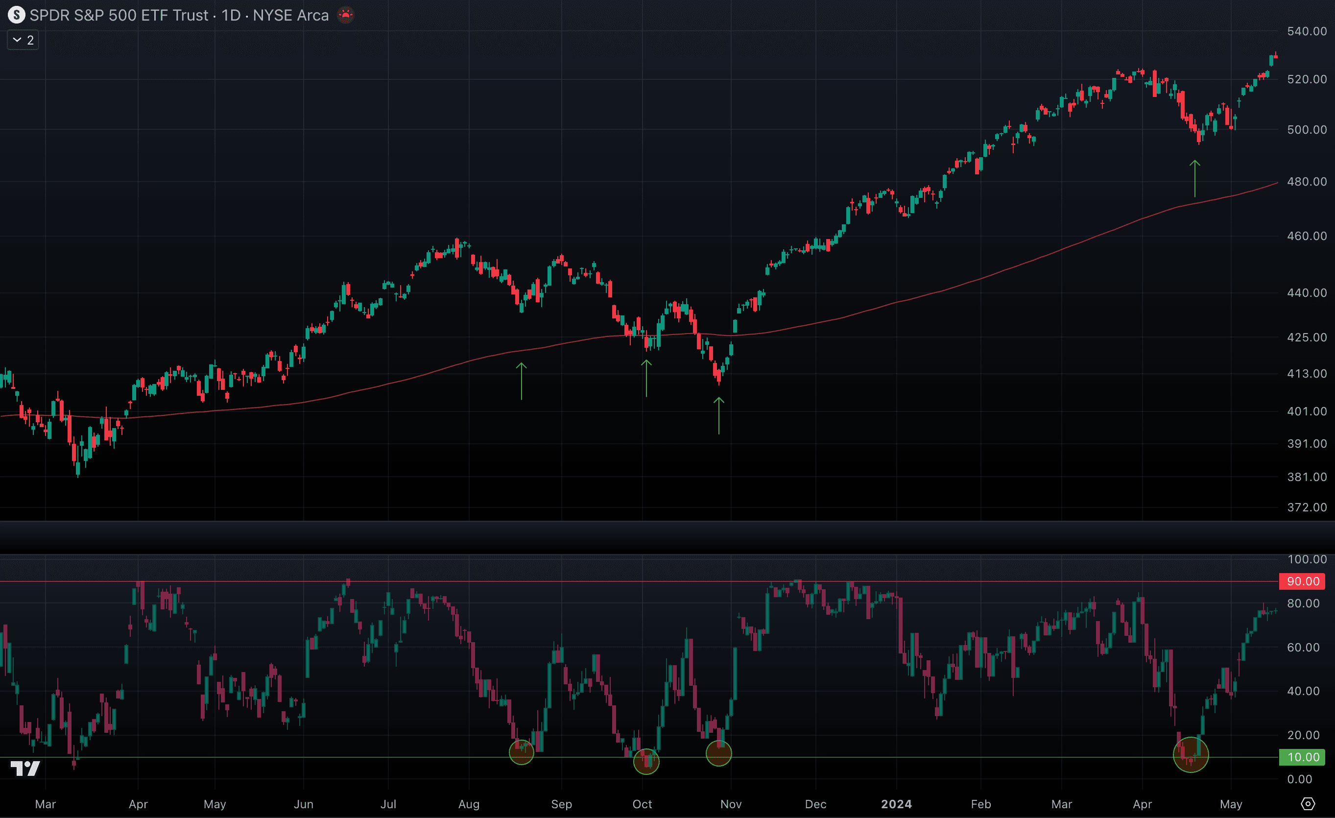
Now, if we line this chart up with SPY, notice how the moments when breadth pushes into extreme levels often coincide with SPY’s own major moves.
S5TW D & SPY D, Chart link: https://www.tradingview.com/chart/DT7Tpcx3/
Isn’t it interesting how extremely low readings — when only a small fraction of stocks are above their 20-day MA — often align with the bottoms of price corrections during an uptrend? The question is, are these just rare coincidences or part of a recurring pattern? Let’s rewind the chart and take a closer look.
What about the Nasdaq (QQQ)? Do we see the same kind of breadth signals showing up there too?
NDTW, percentage of NASDAQ stocks above their 20-day moving average, https://www.tradingview.com/chart/1iew58DF/

But why does this work? If you recall the section on moving averages, we highlighted how the 20 EMA on the daily chart often defines a strong uptrend — with price eventually pulling back to retest it. The same principle applies here, except instead of tracking just one stock, we’re watching hundreds of them doing it at the same time. That collective behavior is what drives the powerful swings in breadth — and those swings give us clear trading signals. Another interesting pattern is that while low extremes in breadth are excellent at signaling pullbacks during an uptrend, high extremes rarely mark the exact top of a swing. This makes sense if you think back to how price behaves around the 20-day MA: in a strong trend, price can stay above that level for a long time before finally pulling back.
The takeaway: in an uptrend, treat low readings as opportunities to join the trend, while high readings simply confirm that momentum is strong — not that the move is about to end. The inverse dynamic shows up during prolonged periods of weakness — when price slips below the 200-day MA and stays there. In these environments, the rules flip: high extremes in breadth can actually provide signals to enter short or bearish trades, as they often mark temporary rallies within a broader downtrend. Meanwhile, low readings can persist for weeks or even months without signaling a true bottom. Fascinating, isn’t it? Breadth adapts with the market’s regime, offering different insights depending on whether we’re in a bull or bear phase.
S5TW D during a period of weakness
So far, we’ve focused on the 20-day moving average, which is excellent for spotting short-term swings in SPY and QQQ. But traders also watch the 50, 100, and 200-day moving averages very closely. And just like with the 20-day, there are breadth indicators built around each of those levels too.
S&P 500 Breadth Indicators
- S5TW — % of S&P 500 above the 20-day moving average: https://www.tradingview.com/chart/nCj3KVaR/
- S5FI — % of S&P 500 above the 50-day moving average: https://www.tradingview.com/chart/H4cGjEoz/
- S5OH — % of S&P 500 above the 100-day moving average: https://www.tradingview.com/chart/DhoHRrQm/
- S5TH — % of S&P 500 above the 200-day moving average: https://www.tradingview.com/chart/GIUQQ9nv/
Nasdaq-100 Breadth indicators
- NDTW — % of Nasdaq-100 above the 20-day moving average: https://www.tradingview.com/chart/rNZ9tVBg/
- NDFI — % of Nasdaq-100 above the 50-day moving average: https://www.tradingview.com/chart/NvpwzEeM/
- NDOH — % of Nasdaq-100 above the 100-day moving average: https://www.tradingview.com/chart/Sn2s96af/
- NDTH — % of Nasdaq-100 above the 200-day moving average: https://www.tradingview.com/chart/F2T1znKD/
Now imagine how strong of a signal we can get when three or all four breadth indicators push into extreme values simultaneously. Each indicator on its own tells us something useful — for example, S5TW (20-day) highlights short-term swings, while S5TH (200-day) reflects long-term market health. But when several of them line up together, it’s like the market shouting in unison. This alignment rarely happens by accident. If, for example, the 20-day, 50-day, and 100-day breadth indicators all collapse into low extremes at the same time, it means weakness isn’t confined to a short-term pullback — it’s spreading across multiple timeframes. That typically marks the kind of capitulation event where fear is widespread and markets are washing out. These moments often precede powerful relief rallies, as sellers become exhausted and even a modest wave of buying can spark sharp reversals.
SPY D chart with all four breadth indicators displayed, https://www.tradingview.com/chart/kgJW3ORk/
 Breadth extremes are rare, but when they align across multiple timeframes, they deliver some of the market’s most powerful and reliable signals.
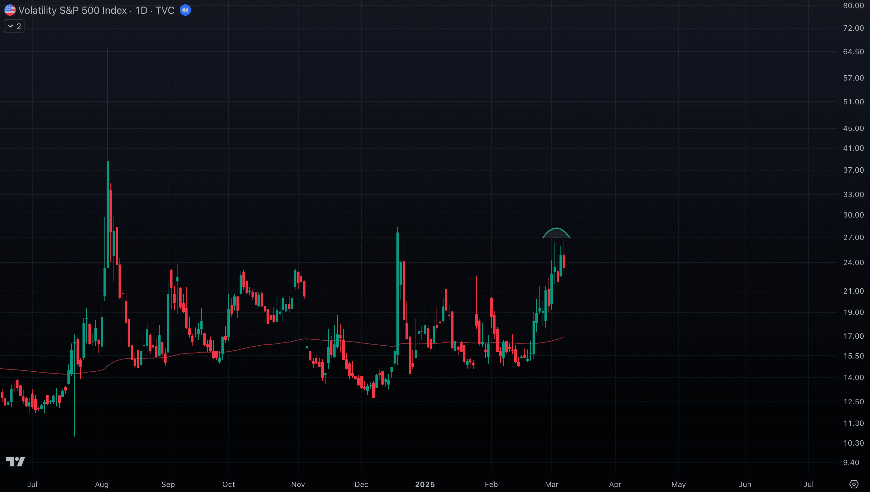
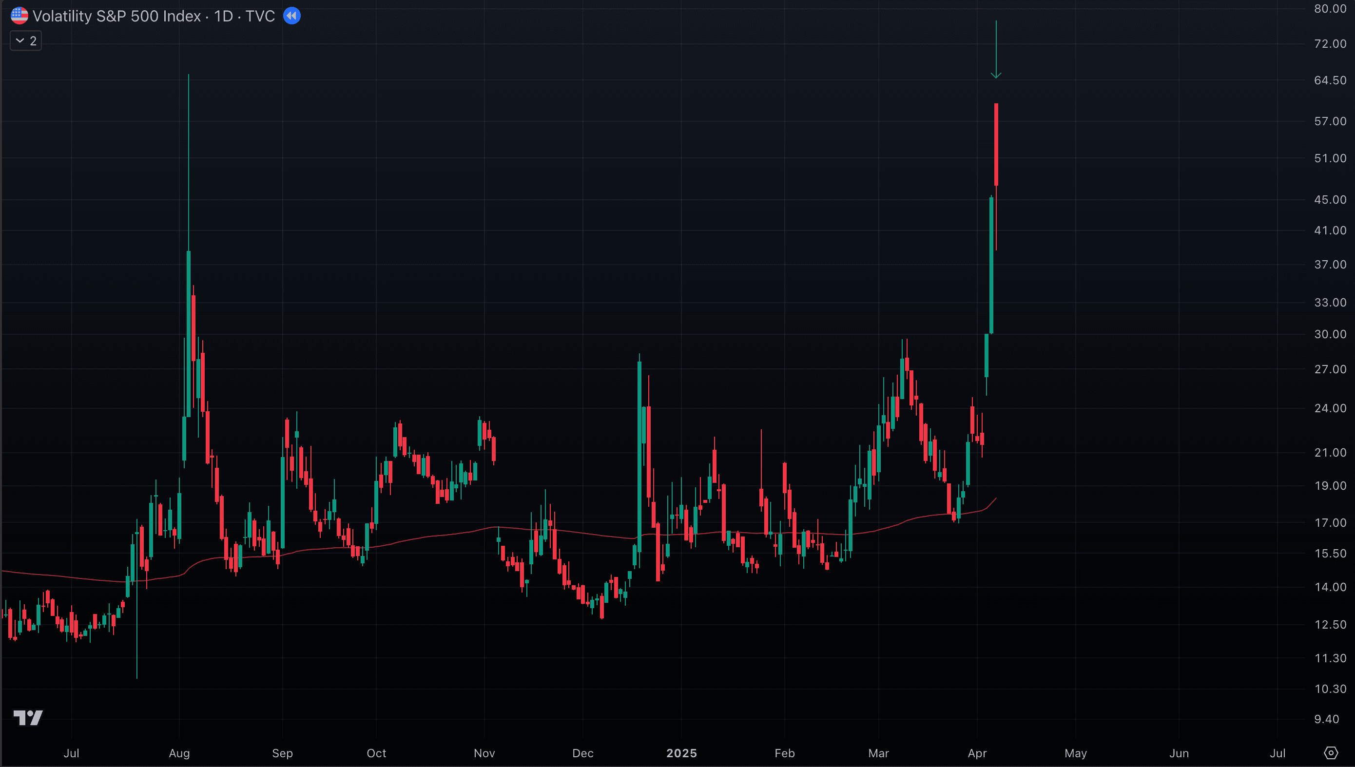
Component: VIX
If breadth shows us participation, the VIX tells us about emotion. Officially called the CBOE Volatility Index, the VIX measures the market’s expectations of volatility in the S&P 500 options market over the next 30 days. Higher values mean participants are bracing for bigger swings. And because most investors hedge by betting on downside, those higher VIX readings usually signal expectations of selling pressure. That’s why the VIX tends to move inversely to SPY — when fear rises, SPY often falls, and when fear fades, SPY usually recovers. Think of the VIX as the market’s fear meter. When it’s low, investors feel calm and confident, so trends usually keep moving higher. When it starts rising, it means big players are buying protection, expecting trouble ahead. And when it spikes really high, it shows panic is peaking — which often lines up with market bottoms, because fear can’t stay extreme for long. But enough words — let’s have a look at the chart. Notice how every time the VIX spikes higher, SPY is usually pulling back at the same moment. And when the VIX cools off and drifts lower, SPY often finds support and starts climbing again. This inverse rhythm between fear (VIX) and price (SPY) is one of the cleanest relationships in the market — and once you see it on the chart, it becomes hard to ignore.
SPY D & VIX D, Chart link: https://www.tradingview.com/chart/DT7Tpcx3/
When you look at the VIX, two patterns stand out: spikes with long wicks and clustering (sustained uptrends).
- Spikes with wicks: These happen when fear explodes suddenly, sending the VIX sharply higher — but then it quickly retreats, leaving a wick behind. For us, that’s often a signal that the worst of the panic is over. Once fear has “blown out,” SPY usually stabilizes, giving us a potential opportunity to rejoin the broader trend.
- Clustering (VIX uptrend): This is when the VIX doesn’t just spike and fade but stays elevated or grinds higher for weeks. That persistence shows traders are consistently pricing in bigger moves, usually to the downside. In this case, it’s a warning sign — caution is warranted, because extended VIX strength often lines up with ongoing weakness or choppy conditions in SPY.
The VIX is a vital part of our system because it captures market psychology. While price and breadth show what stocks are doing, the VIX shows what traders expect. Spikes often mark the end of panic and a chance to rejoin the trend, while clustering warns of sustained risk. By reading fear directly, the VIX gives us an edge in timing entries and managing caution.
Compounding Components
Each component on its own — indices, futures, breadth, or VIX — gives us valuable insight. But the real power of this system comes when we combine them. Think of it like layering signals: the more components that align, the clearer the market’s roadmap becomes. When two or three tools flash the same message, we have confirmation. When all of them point in the same direction, that’s when conviction is highest. In those rare moments of alignment, the signal is strong enough to act more aggressively — pressing winners, scaling positions, or entering with confidence. The system works by compounding clarity. One component tells us something; several together tell us the truth. We’ve built the system, piece by piece. Now comes the real test — using it in the market. This is where signals turn into action, and analysis becomes profit or loss. Let’s step into the trades.
Trades: 2023
In October 2023, the general sentiment was increasingly grim, with analysts and “experts” predicting the market was entering a bear phase as stubborn inflation persisted and the Federal Reserve signaled it would keep interest rates higher for longer. But we know the story and we know where to look - chart will tell us everything we need to know.
- SPY D approached the 200 EMA and closed with a wick. That alone gave us a valid setup — but we also had breadth confirmation: both S5TW and S5FI at extreme lows within an uptrend. That meant at least three components were aligned, so we took the trade (Entry 1)
SPY D with S5TW & S5FI
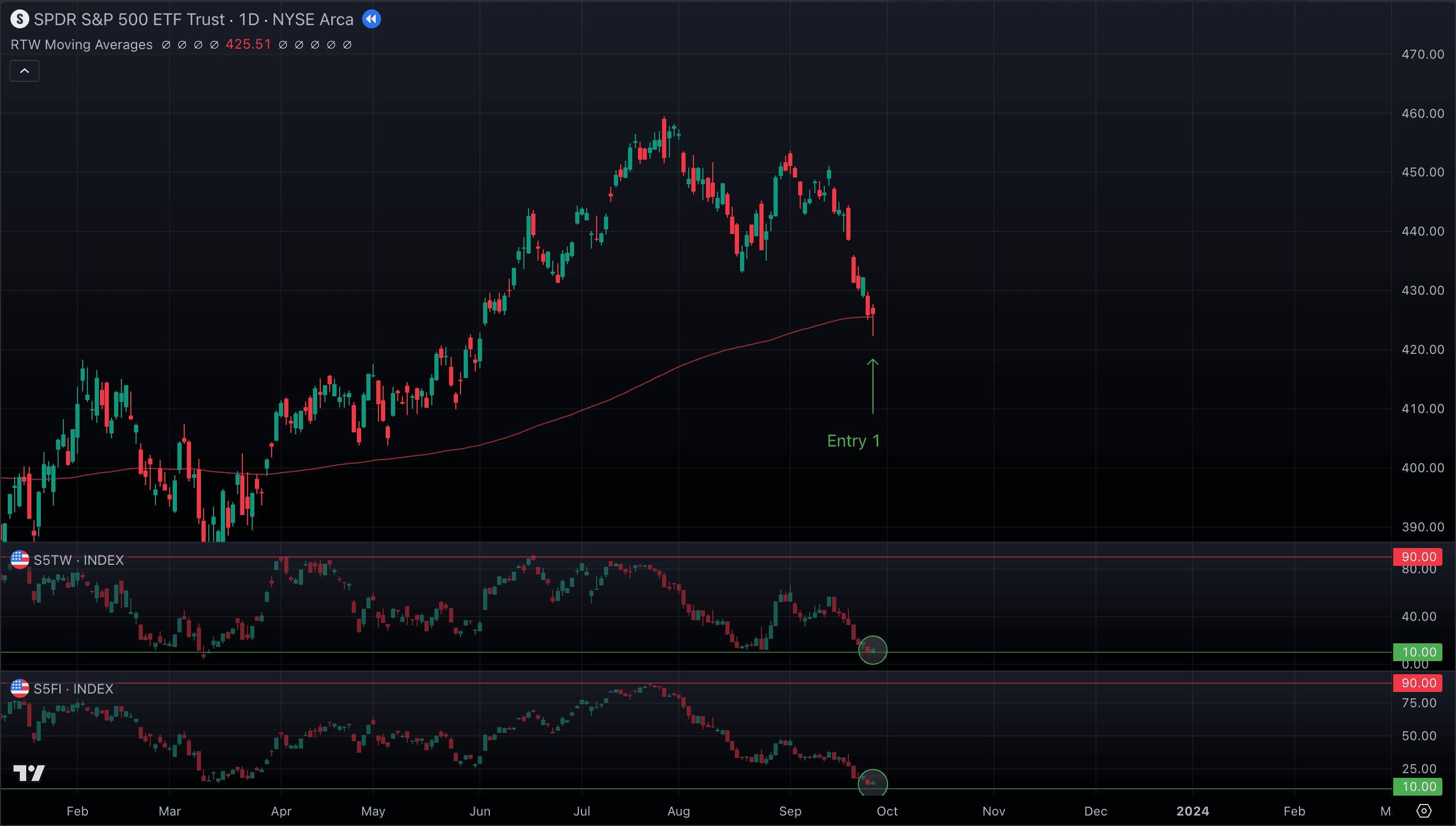
- Price bounced and moved in our favor, but within two days it reversed. Since we had already moved our stop to break-even after a 1% gain, we were taken out flat.
SPY D with S5TW & S5FI
- Two days later, SPY showed renewed strength: a strong green candle followed by another with a wick, confirming the level was holding. S5TW and S5FI remained at extremes. We entered again before the daily close. (Entry 2)
SPY D with S5TW & S5FI
- Once more, price initially moved our way — then rolled over, and we closed the trade at break-even again.
SPY D with S5TW & S5FI
- By October 30, the market delivered a far stronger signal. This time, we didn’t just have two components lining up — we had a full stack of confluence:
- SPY Breadth: S5TW, S5FI, and now S5OH all at extremes.
- Tech Confirmation: QQQ D bouncing off its 200 EMA, with NDTW and NDFI breadth at extremes.
- Semis Support: SMH D also at its 200 EMA, with repeated wicks showing strong defense of the level.
SPY D with S5TW, S5FI & S5OH
QQQ D with NDTW, NDFI & NDOH
SMH D and its 200 EMA D
At this point, it wasn’t just a setup — it was the market screaming at us. With so many components aligned at such critical levels, the risk/reward profile was exceptional. That’s when we acted decisively: not just entering again, but doubling the position on Entry 3.
- The SPY price rocketed through the 200 EMA D, triggering another entry (see Trading Gaps) — Entry 4. From there, we added five more trades along the way. Not every one was a winner; some closed at break-even. But that hardly mattered. This sequence became the best trade of the year — where we captured an exceptional trend and generated a significant share of our annual performance.
SPY D

The Market Components Analysis System gave us the clarity to read the entire setup as it unfolded — to trust the signals, ignore the headlines, and cut through all the media noise. Instead of reacting to fear or hype, we followed the market’s internal engine — and it delivered.
Trades: 2024
Another excellent opportunity to test the system appeared in March 2025, when SPY once again approached its 200 EMA D. Just as before, this level acted as a critical decision point — giving us the chance to see whether the alignment of components would confirm support and offer a high-conviction entry.
- We opened our entry position on March 7th, with confirmation at 200 EMA from SPY itself, QQQ, and what looked like a local top on the VIX. When you see this kind of interaction at the key levels - you have to act
SPY D and its 200 EMA D
QQQ D and its 200 EMA D
VIX D
- The price then dropped lower and consolidated for more than two weeks before launching through the 200 EMA — only to be rejected and fall back below the level on both QQQ and SPY. Recognizing the weakness of both SPY & QQQ, we closed the trade at a small loss.
SPY D
QQQ D
- April 7th brought the next real opportunity, right after a violent selloff. This time the signals were impossible to ignore:
- SPY Breadth: S5TW, S5FI, and S5OH all at extremes.
- Tech Breadth: NDTW, NDFI at extremes.
- VIX: After a giant volatility spike, we finally saw signs of a peak — a bullish signal for the market.
SPY D
QQQ D
VIX D
- This entry was incredibly successful and after volatility has thinned out we’ve seen another excellent trend for SPY and the whole market that lasts till this day. We have added 6 more positions to the trend at the pullbacks to 20 EMA D and unwinded part of our positions on the gap down beginning of August
SPY D
Once again, the Market Components Analysis System gave us the clarity to distinguish noise from true opportunity. It kept us cautious during the March false breakout, then gave us the conviction to step in with size after the April washout. That discipline turned what could have been a frustrating period into another major winning trade cycle of the year.
Risk Management
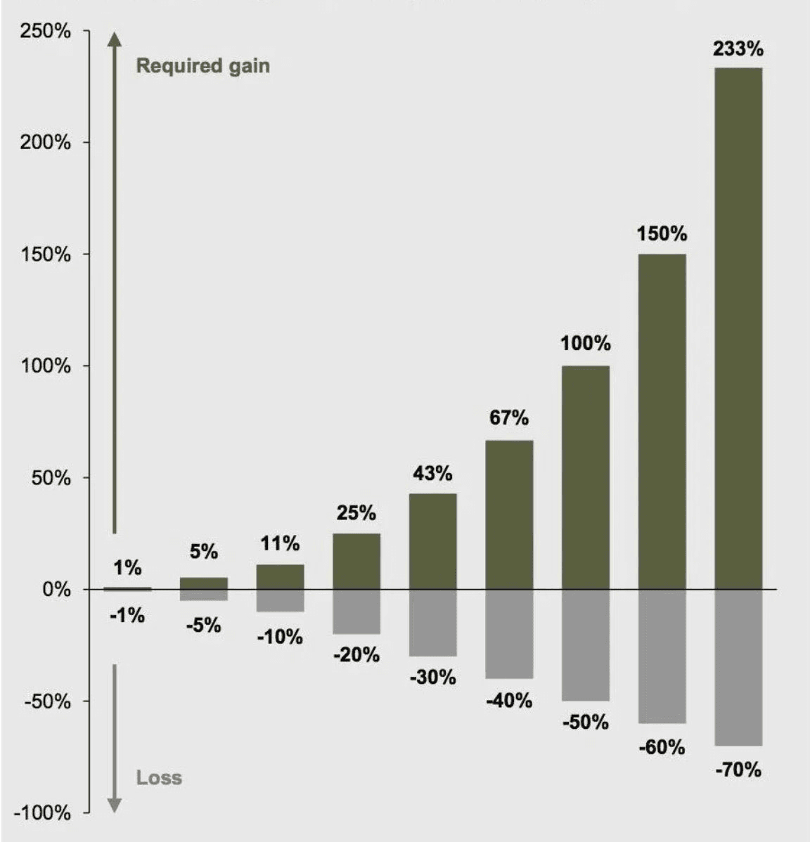
The first and most important trading principle is protecting your capital. Without disciplined risk management, just a handful of bad trades can erase months—or even years—of progress. As professionals often remind us: “you can’t make money if you don’t have money to trade with.” The math of losses is brutally asymmetrical. A 50% drawdown requires a 100% gain just to break even. A 70% loss demands a staggering 233% recovery. This imbalance underscores why capital preservation must take priority over chasing aggressive gains.
Small Positions
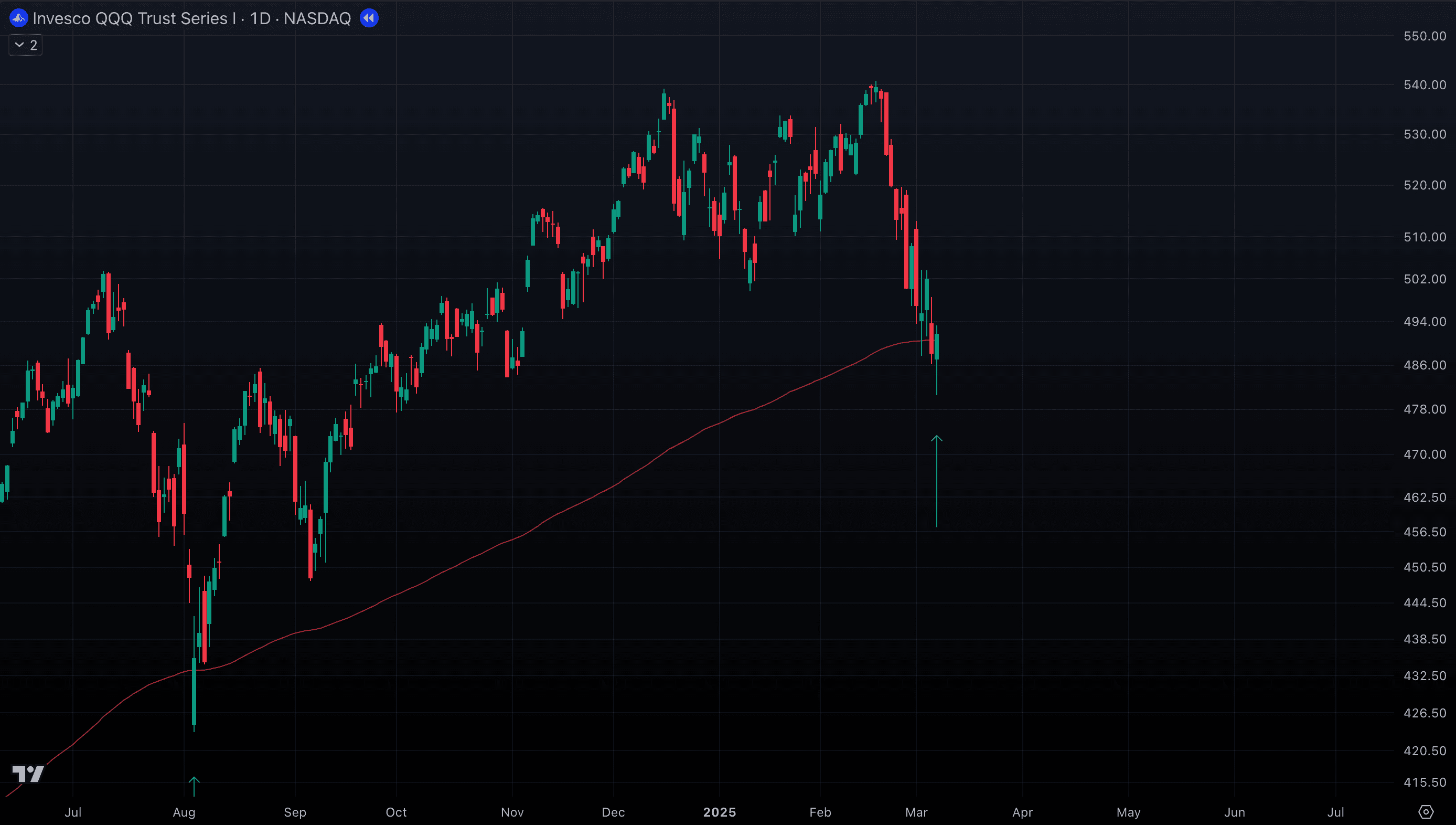
Keep position sizes small and consistent—start with 5% of your portfolio per trade. With a 10% max stop, this means you risk only 0.5% of total capital per trade. This keeps risk contained while giving the market time to confirm your thesis. If the trade begins to move in your favor, you’ll have room to add — but if it fails immediately, the damage is minimal. Think of the first entry as a test order that lets the market prove itself. There are exceptions: higher risk can be justified at strategic levels such as the 200 EMA (daily or weekly), where the risk-to-reward profile is particularly favorable.
QQQ D, risk / reward ratio for the 200 EMA entry
Protection First
Once a trade moves +1% in your favor, immediately move the stop to breakeven. This transforms the position into a “free ride” — downside is eliminated, but upside potential remains open. It may feel conservative, but capital preservation is always the priority. Protecting gains early ensures that even a string of failed follow-up trades won’t meaningfully erode your account.
Sequential Adding
Never pile into multiple trades at once without confirmation. New positions should only be added when existing ones are already showing a profit (and you have moved your stop to the break even). This forces discipline: you expand exposure from a base of strength, not from hope. By scaling into winners and ignoring losers, your portfolio naturally tilts toward trades that are working, while weak setups are cut off early.
Maximum Exposure
Regardless of how strong the market looks, cap your total open risk at 20% of portfolio value. These applies only to the positions that are not at break even yet. This rule prevents overexposure during sharp corrections or unexpected events. If several positions are already active and near breakeven, you can layer in more — but if they’re all still “at risk,” adding further exposure puts the entire account in danger. Limiting simultaneous risk ensures survivability through black swan events and keeps you in the game long term.
Probability Requires Repetition
Think of a coin flip: the 50/50 probability doesn’t reveal itself in 1 or 2 flips — only after many repetitions (100+) does the average result converge on the true odds. This is the Law of Large Numbers: probabilities only become reliable when tested over a large enough sample size. Trading works the same way. A single trade is just noise — it might win or lose, regardless of how good the setup is. What matters is the outcome of a series of trades executed with discipline. Over dozens or hundreds of trades, the edge built into your rules and process starts to show up. This is why consistency is critical: following the framework trade after trade allows probabilities to work in your favor. Focusing too much on one outcome creates emotional swings, but thinking in terms of the long run turns trading into a repeatable, almost mechanical process.
Emotional Control
Large losses create emotional stress that almost always leads to poor decisions. When positions are oversized, fear and greed take over, causing traders to:
- Hold onto losing positions too long, hoping for a rebound
- Exit winning trades prematurely out of fear of losing gains
- Enter impulsive “revenge trades” in an attempt to recover losses
Maintaining emotional control begins with proper risk management and disciplined position sizing.
Key Psychological Principles
- Trade to protect capital, not to make money. Survival comes first. Your edge only works if you stay in the game. Every decision should be framed around limiting losses and protecting capital — profits are simply the byproduct of consistent discipline.
- No emotions when closing winners or losers. Stress clouds judgment. If you feel anxious about a position, it’s a sign your size is too big. Scale down to 1–2% and trade comfortably. Confidence comes not from hoping but from controlling risk.
- Patience over action. The market doesn’t pay you for activity; it pays you for waiting until the odds stack in your favor. About 80% of the time, no valid signals appear — and that’s perfectly normal. Learn to observe without forcing trades.
- Quality over quantity. As you’ve witnessed in our trades handful of high-probability setups will outperform dozens of random trades. Each trade should stand on the strength of multiple aligned components. Don’t chase; wait until the market hands you the trade.
- Risk management over returns. Returns are unpredictable, but risk is always in your control. Managing drawdowns protects both your capital and your mindset. A small loss is a lesson; a big loss is a setback that erodes confidence and consistency.
- Fear is ok, trust in the system. You will feel most afraid when the best opportunities appear — when panic is peaking and breadth/VIX extremes are flashing. That’s when you must trust the system. Remember: you can’t make money without taking risk — but you can take the right risk.
Black Swan Events
Black swan events are rare, unpredictable disruptions with devastating market impact—clear only in hindsight. They expose the inherent limits of all analysis and prediction models. Notable recent examples include:
- 2008 Financial Crisis: Lehman Brothers collapse triggered a global meltdown
- COVID-19 Pandemic (March 2020): Markets plunged 30–40% within weeks
- Russian Invasion of Ukraine (2022): Sent energy and commodity markets into chaos
During such events, technical signals lose meaning—markets can gap down 20–30% overnight with no warning. No model can predict a pandemic or geopolitical shock. The only true defense is risk management: always control your Capital at Risk (positions not yet at break-even or without a substantial move in your favor).
- For beginners: limit Capital at Risk to 10% of your portfolio.
- For experienced traders: up to 20–30% may be acceptable.
Using Leverage
Once you’ve mastered the Strategy and Framework, you may choose to increase your market exposure through leverage. It’s important to remember that leverage magnifies both profits and losses. Used responsibly, it can accelerate growth; used recklessly, it can destroy an account. There are several common ways to apply leverage depending on where and how you trade:
- Margin Account. With a margin account, you borrow money from your broker, paying an interest rate (typically close to the risk-free rate, though it varies by broker and amount). For example, Interactive Brokers often allows trading at 2.5–3x your actual portfolio size.
- Options. Options provide significant leverage by allowing you to control 100 shares of a stock (worth thousands of dollars) for the price of a premium (often only a few hundred dollars). This dramatically amplifies both gains and losses. Options are powerful and versatile instruments—but also extremely risky if misused. They require a dedicated discussion of their own.
- Leveraged ETFs. Leveraged ETFs are designed to deliver 2x or 3x the daily return of their underlying index. However, because they reset leverage daily, they suffer from compounding drag in volatile markets. Even if the underlying index returns to breakeven after swings up and down, the leveraged ETF can lose value.
Example: If an index rises 10% and then falls 9.09%, it returns to breakeven. A 2x leveraged ETF would rise 20% and then fall 18.18%, leaving you with a 1.64% loss despite the index being flat. Still, when used carefully, leveraged ETFs can be effective tools. Some of the most popular include:
- 3x Bull (Long) Leveraged ETFs
- UPRO — 3x S&P 500
- SPXL — 3x S&P 500 (alternative)
- TQQQ — 3x Nasdaq 100
- UDOW — 3x Dow Jones
- SOXL — 3x Semiconductors (Philadelphia Semiconductor Index)
- TECL — 3x Technology Sector
- 2x Bull (Long) Leveraged ETFs
- SSO — 2x S&P 500
- QLD — 2x Nasdaq 100
- DDM — 2x Dow Jones
Managing Stops with Leveraged ETFs
When trading leveraged ETFs, always base your strategy on the underlying ETF (e.g., SPY, QQQ, SMH). Your entry, stop, and break-even rules are defined by the underlying instrument — not the leveraged one. The stop does not change. If your SPY setup calls for a 5% stop, the stop is still 5% on SPY. That’s the signal you follow. What you do need to adjust is your position size (risk) when using a leveraged ETF. Because a 3× ETF like UPRO will move about three times as much as SPY, you must reduce your size so the dollar risk remains consistent.
Important Disclaimer on Leverage
Leverage is a double-edged sword. While it can significantly amplify returns, it also magnifies losses, often faster than expected. Mismanaging leverage can quickly erode or even wipe out an account.
- Leveraged products (margin, options, and leveraged ETFs) require strict discipline, risk control, and emotional stability.
- Leveraged ETFs in particular are designed for short-term trading; due to daily rebalancing and compounding effects, they can underperform over time, especially in volatile markets.
- Past performance does not guarantee future results. Using leverage is not suitable for all investors.
This material reflects our own use of leverage within a defined strategy and risk framework. It should not be taken as financial advice or a recommendation. Anyone considering leverage should carefully evaluate their financial situation, risk tolerance, and trading experience — and if in doubt, consult a licensed financial professional before applying it.
How to analyze performance
Up to this point, we’ve built a framework for how to trade — focusing on following momentum, managing risk, and repeating a consistent process. But knowing the rules is only half of the picture. To improve and sustain your results, you also need a way to measure whether the strategy is truly working. That’s where performance analysis comes in. By tracking a few key metrics, you move beyond gut feeling and judge your trading with the same discipline that professionals use. This ensures you’re not just trading — you’re trading with accountability.
Return (Total/Annualized)
What it measures: Your overall profit or loss, typically expressed as a percentage.
Calculation:
- Total Return = (Ending Value - Starting Value) / Starting Value × 100
- Annualized Return = (1 + Total Return)^(1/years) - 1
Why it matters: This is your bottom line - how much money you actually made. However, return alone is meaningless without context about the risk taken to achieve it.
Key insight: A 50% annual return sounds impressive, but not if you risked losing 80% of your capital to get it.
Maximum Drawdown (Max DD)
What it measures: The largest decline from peak to trough in your account value during any period.
Formula: Max DD = (Peak Value – Trough Value) ÷ Peak Value × 100
Example: If your account grows from $100K to $130K, then falls to $85K before recovering, your Max DD is 35% (from the $130K peak to the $85K trough).
Why it’s critical:
- Shows your worst-case scenario
- Reflects how much pain you had to endure to stay invested
- Indicates whether your strategy is psychologically and financially sustainable
Portfolio Standard Deviation & Return Distribution
Standard deviation measures how much your returns typically vary from the average. It’s the primary metric for volatility and risk.
Example:
- Low-Volatility Strategy
- Average Return: 20%
- Standard Deviation: 5%
- Sharpe Ratio: 3.6 (explained in the next section)
- High-Volatility Strategy
- Average Return: 20%
- Standard Deviation: 20%
- Sharpe Ratio: 0.9
Both deliver the same average return, but Strategy B is far riskier because its returns swing much more widely. Now lets compare two strategies:
Return Distribution Comparison
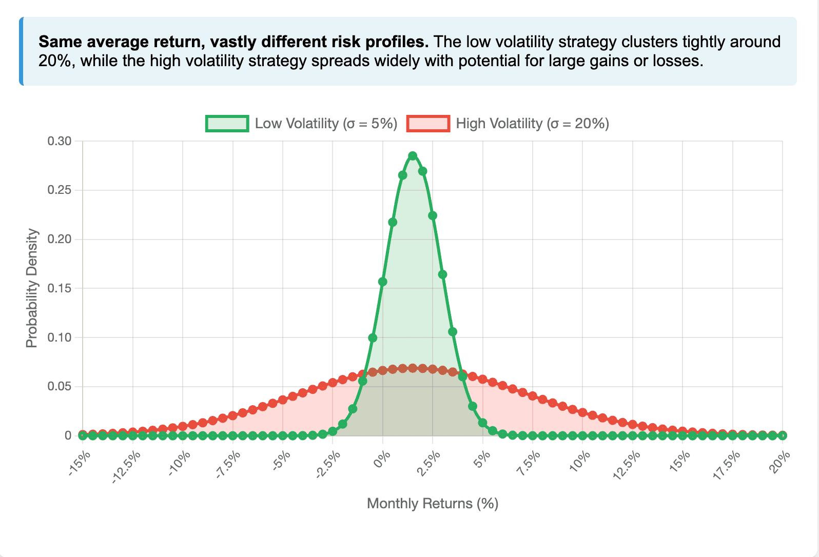
Two strategies may deliver the same average return, yet their risk profiles can be drastically different depending on standard deviation. The simulations below illustrate why standard deviation is such a critical factor in evaluating any strategy:
Simulation 1
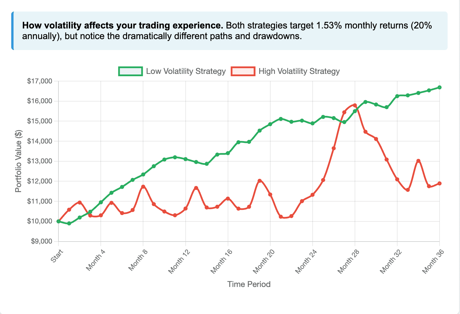
Simulation 2

Simulation 3
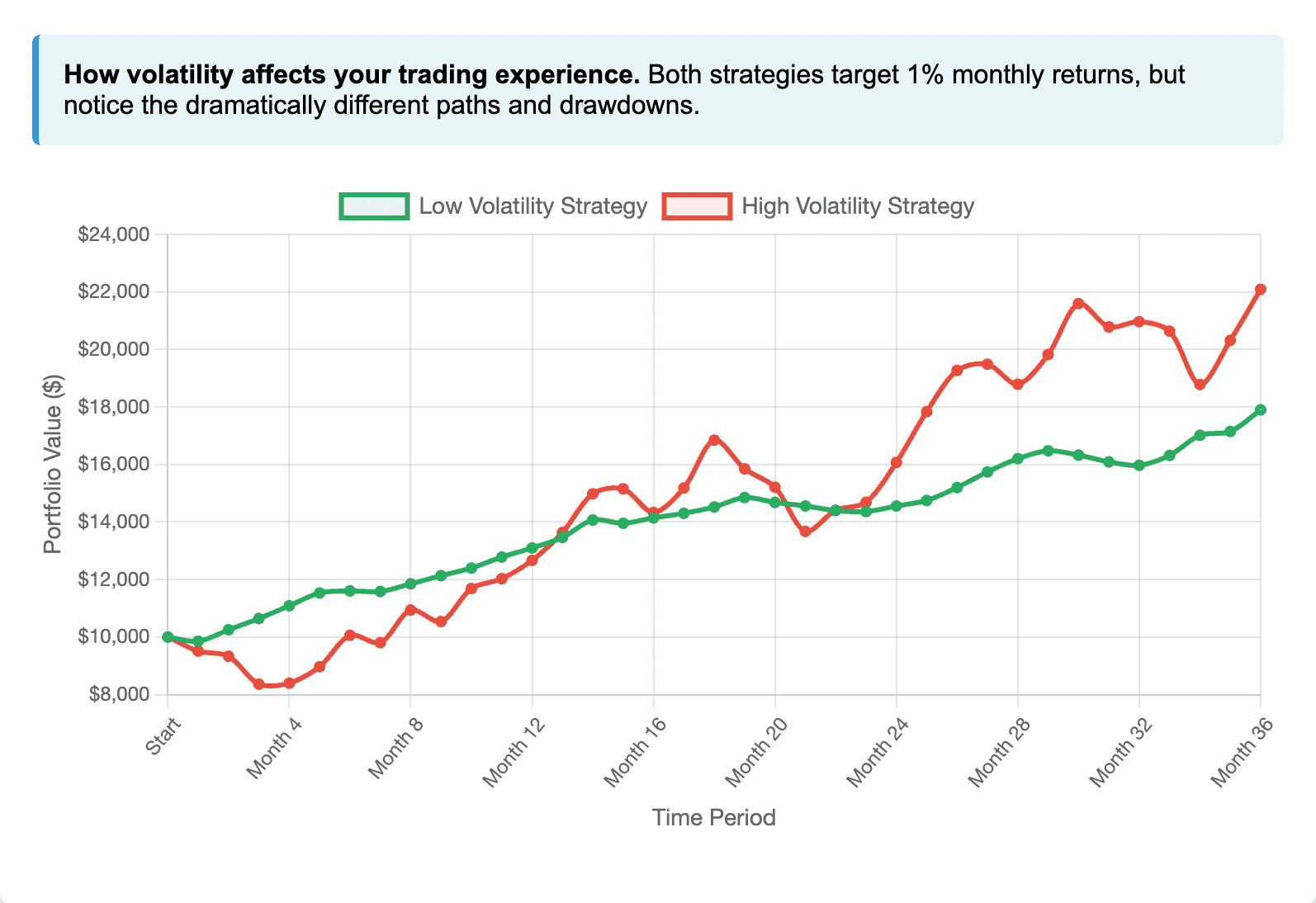
Which Strategy Would You Choose?
The simulation results are clear: the low-volatility strategy delivers superior risk-adjusted returns. You achieve the same average return with roughly 75% less volatility, producing a Sharpe ratio nearly four times higher.
Bottom line: Standard deviation isn’t just a formula—it shapes your real-world trading experience, your drawdowns, and ultimately your probability of long-term success.
Sharpe Ratio
What it measures: Risk-adjusted return—how much excess return you earn for each unit of volatility.
Formula: Sharpe Ratio = (Portfolio Return – Risk-Free Rate) ÷ Portfolio Standard Deviation
Interpretation:
- Above 1.0: Good risk-adjusted performance
- Above 2.0: Excellent performance
- Below 0: Underperforming risk-free investments
Why it matters: The Sharpe ratio reveals whether your returns justify the risks taken. A strategy with 15% returns and a 0.5 Sharpe ratio may actually be worse than one with 12% returns and a 1.5 Sharpe ratio.
How These Metrics Work Together
The ideal trader profile combines:
- High returns: Strong profitability
- Low max drawdown: Avoiding catastrophic losses
- High Sharpe ratio: Consistency and sustainability in performance
Warning signs to avoid:
- High returns with high drawdowns → unsustainable risk
- Low Sharpe ratio → poor risk management
- Erratic performance → gambling, not systematic trading
Our Performance
Reference portfolio performance 2023
Reference portfolio performance 2024
Disclaimer
The performance results presented here are based on our own experience using the Market Components Analysis System. These results reflect how we applied the framework in practice and are not a guarantee of future performance.
We are comfortable using leverage to amplify returns, but it also magnifies risks. This approach requires strict risk management, emotional control, and discipline. Trading is inherently difficult, and even with a sound system, drawdowns and losses are inevitable.
Nothing in this section should be taken as financial advice or a recommendation. Every trader’s situation, capital base, and risk tolerance are different. Before applying leverage or trading strategies like ours, you should carefully consider your own circumstances and, if necessary, consult with a licensed financial professional.
Remember: the goal of this framework is to provide structure and clarity — but the outcome always depends on execution, discipline, and risk control.